Tea has always been a bridge between people, cultures, and generations. Its warmth and familiarity create connections, but its traditional form sometimes feels distant from the fast-paced lives of modern consumers. Freshleaf Sparkling Tea reimagines tea as a contemporary celebration - a vibrant, fizzy companion to the everyday moments of Gen Z and Millennials.
Widarto Impact took on the challenge of translating this vision into a visual and strategic identity that resonates deeply with today's audience. The result is a brand that feels fresh yet rooted, playful yet sophisticated, approachable yet premium. Freshleaf Sparkling Tea is more than just a drink - it's an invitation to reconnect with tradition in a way that feels entirely new.
A BOLD VISION FOR A VIBRANT GENERATION
Freshleaf Sparkling Tea was created with a distinct audience in mind: individuals who value authenticity but crave innovation. The project began with a clear insight: modern consumers want products that reflect their dynamic lifestyles, but they also seek emotional connections with the brands they choose.
We set out to design a brand identity that bridges this duality. Freshleaf needed to honor the heritage of tea while confidently stepping into the realm of sparkling beverages - a space dominated by energy and excitement. The challenge was to create a product that feels at home on supermarket shelves, in social media feeds, and at personal gatherings.
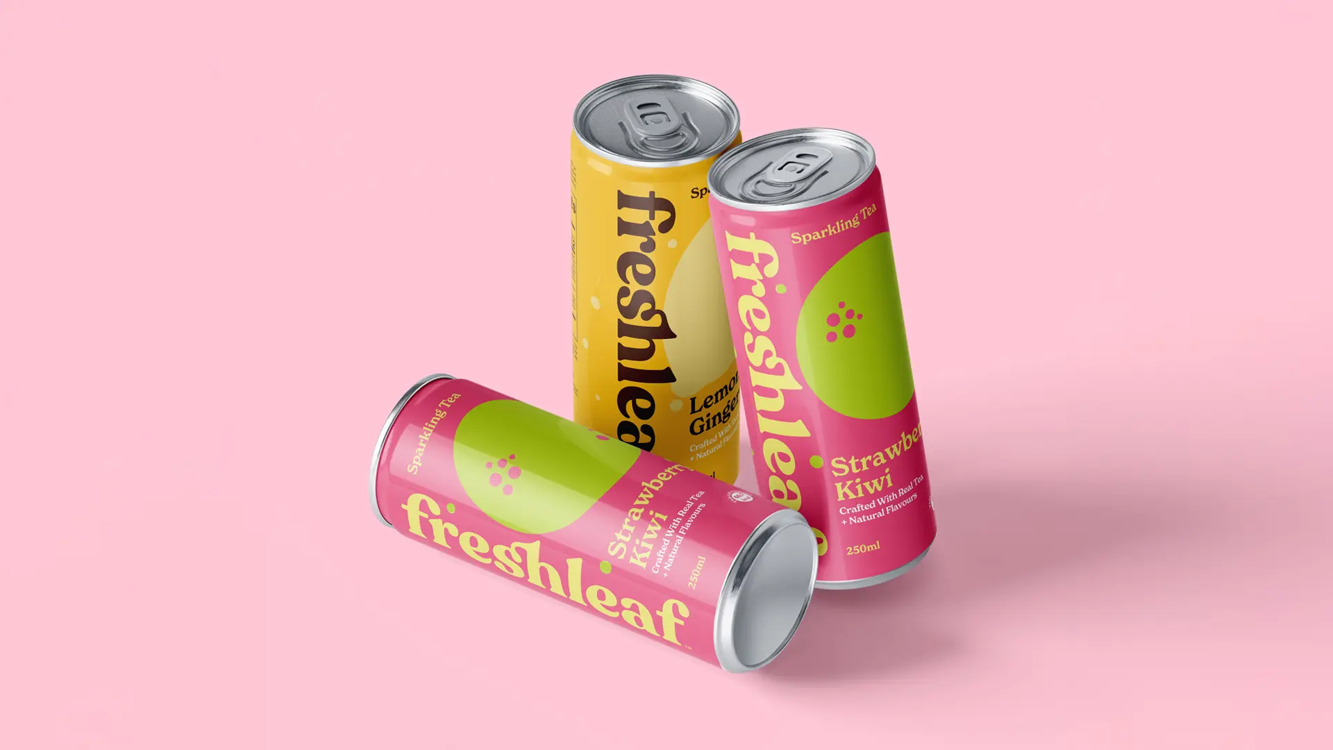
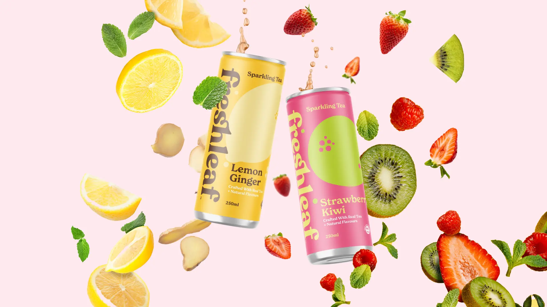
COLORS THAT EVOKE FEELING
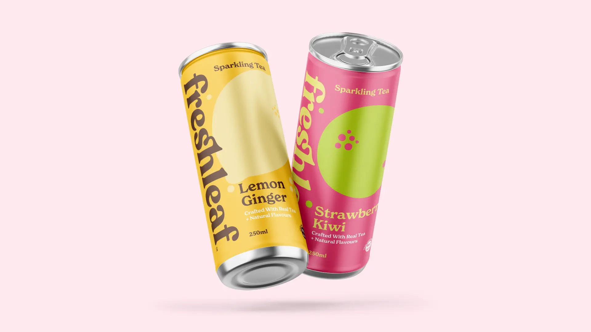
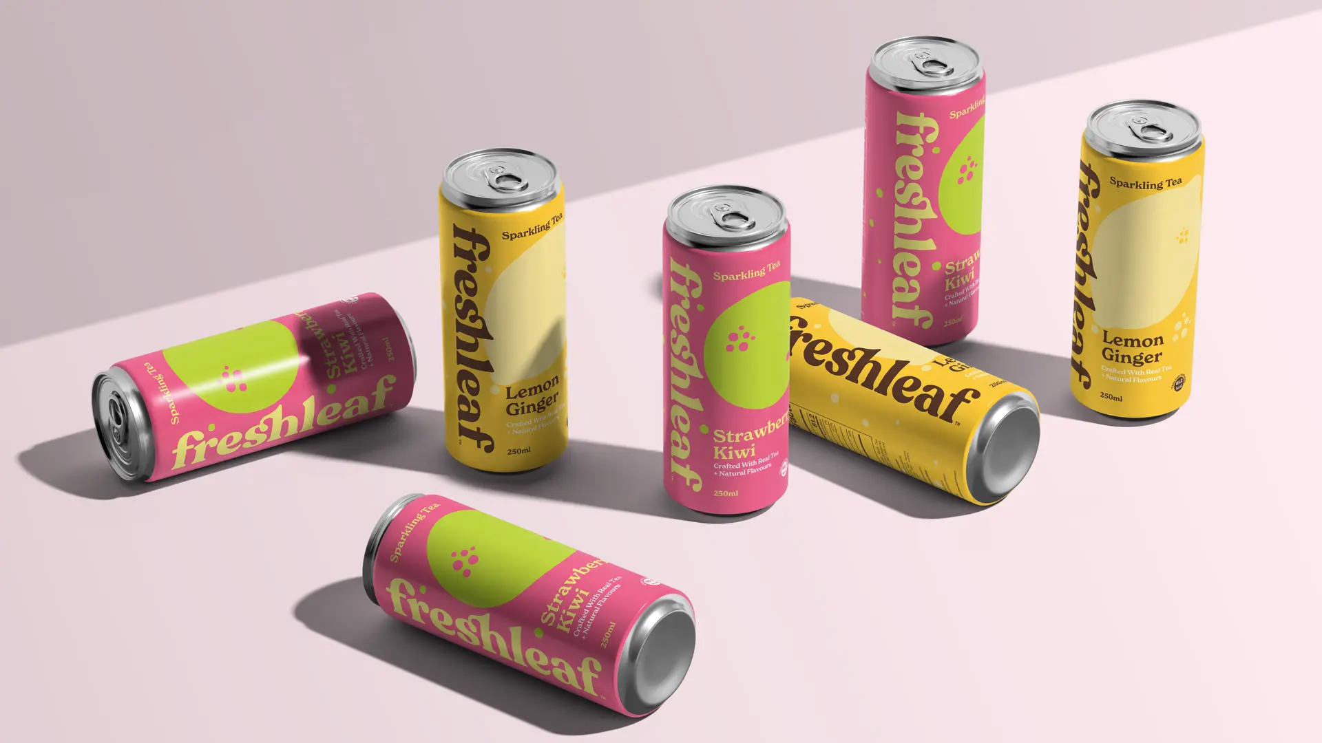
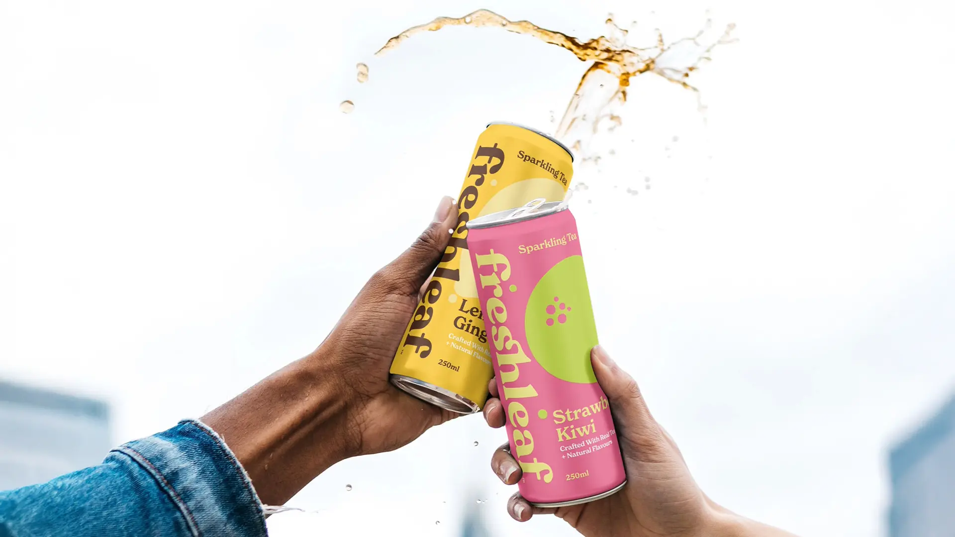
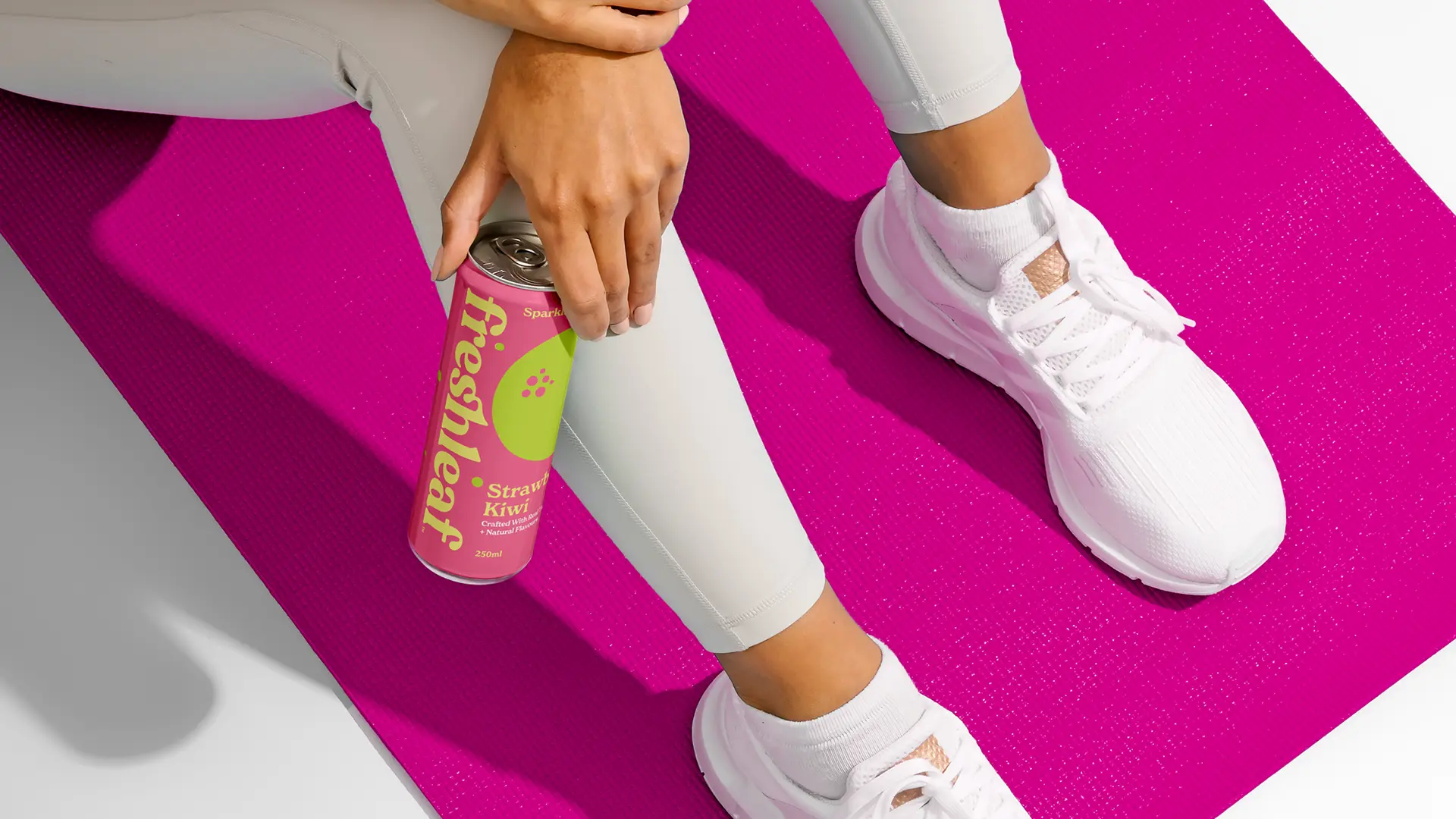
Color plays a central role in Freshleaf's design strategy, acting as a bridge between the product and its audience's emotions. The palette is carefully curated to evoke specific feelings, enhancing the product's appeal and deepening its connection with consumers. Bright citrus yellow exudes optimism and energy, capturing the refreshing zest of the beverage. Soft herbal green offers a sense of calm and balance, reflecting the natural and soothing essence of tea. Meanwhile, blush peachy pink adds a playful, nostalgic touch, reminiscent of carefree, joyful moments.
These colors are not just visual elements - they are emotional triggers that create a sensory experience. Together, they weave a story of freshness, comfort, and delight, making Freshleaf Sparkling Tea more than just a product; it's a vibrant celebration of life and flavor.
TYPOGRAPHY AND SIMPLICITY
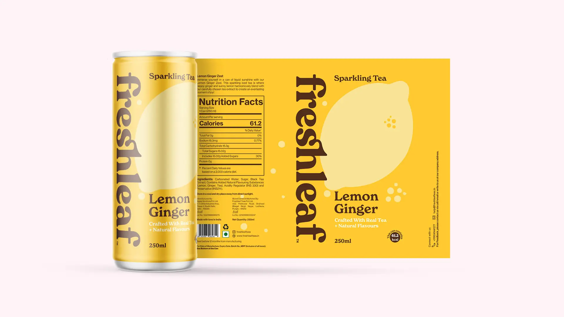
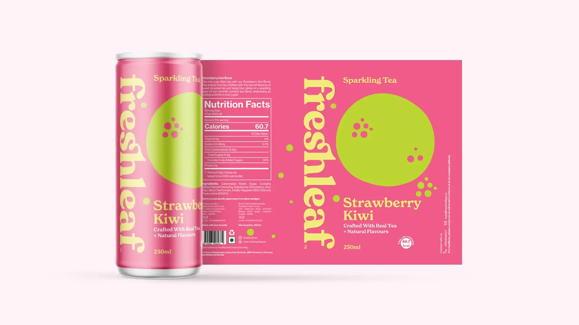
The Freshleaf logotype combines modernity with softness, reflecting the brand's approachable yet sophisticated personality. The clean, sans-serif typography ensures clarity, while subtle detailing adds warmth, inviting consumers to engage. Supporting text and flavor descriptions are structured with a clear hierarchy, balancing boldness with simplicity.
This careful typographic design ensures the brand remains legible and visually appealing, whether on a can in a supermarket or a screen on Instagram. It's a system that is as flexible as it is timeless, mirroring the versatility of Freshleaf Sparkling Tea itself.
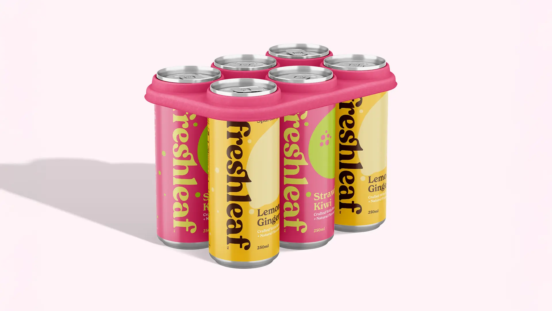
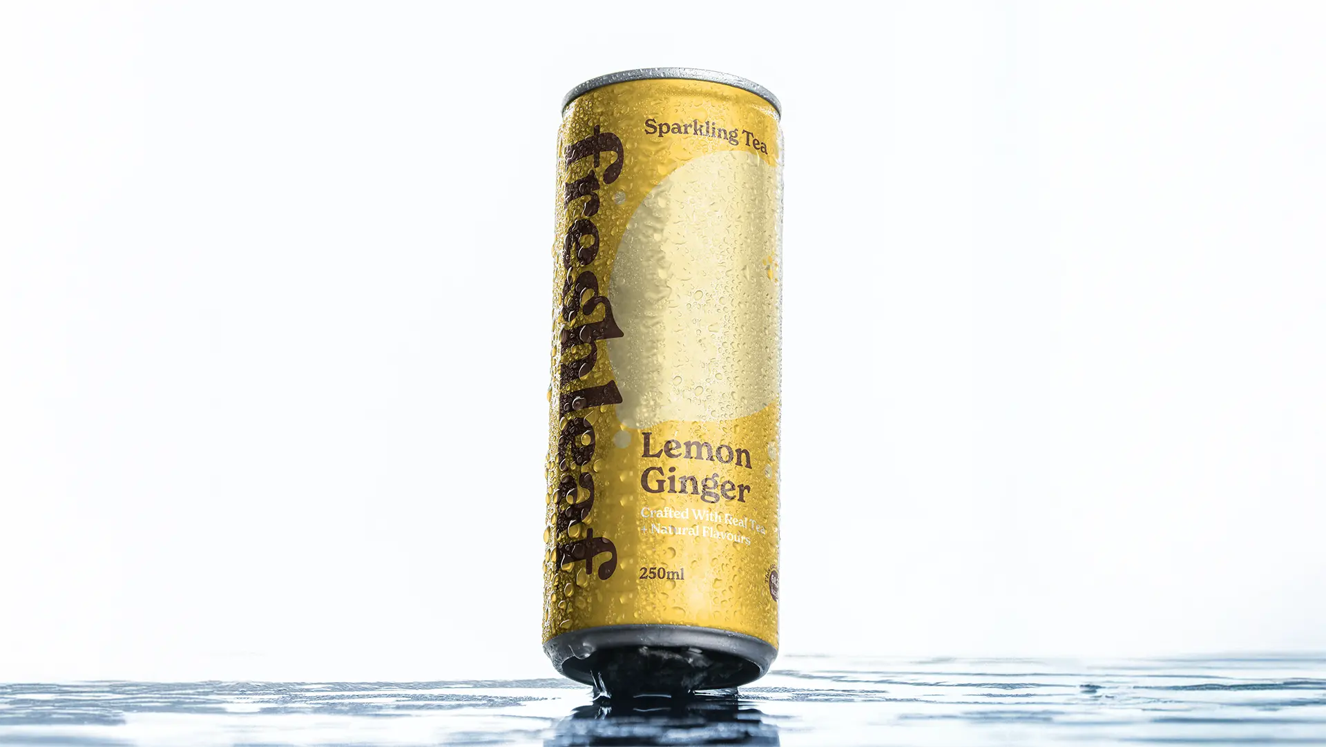
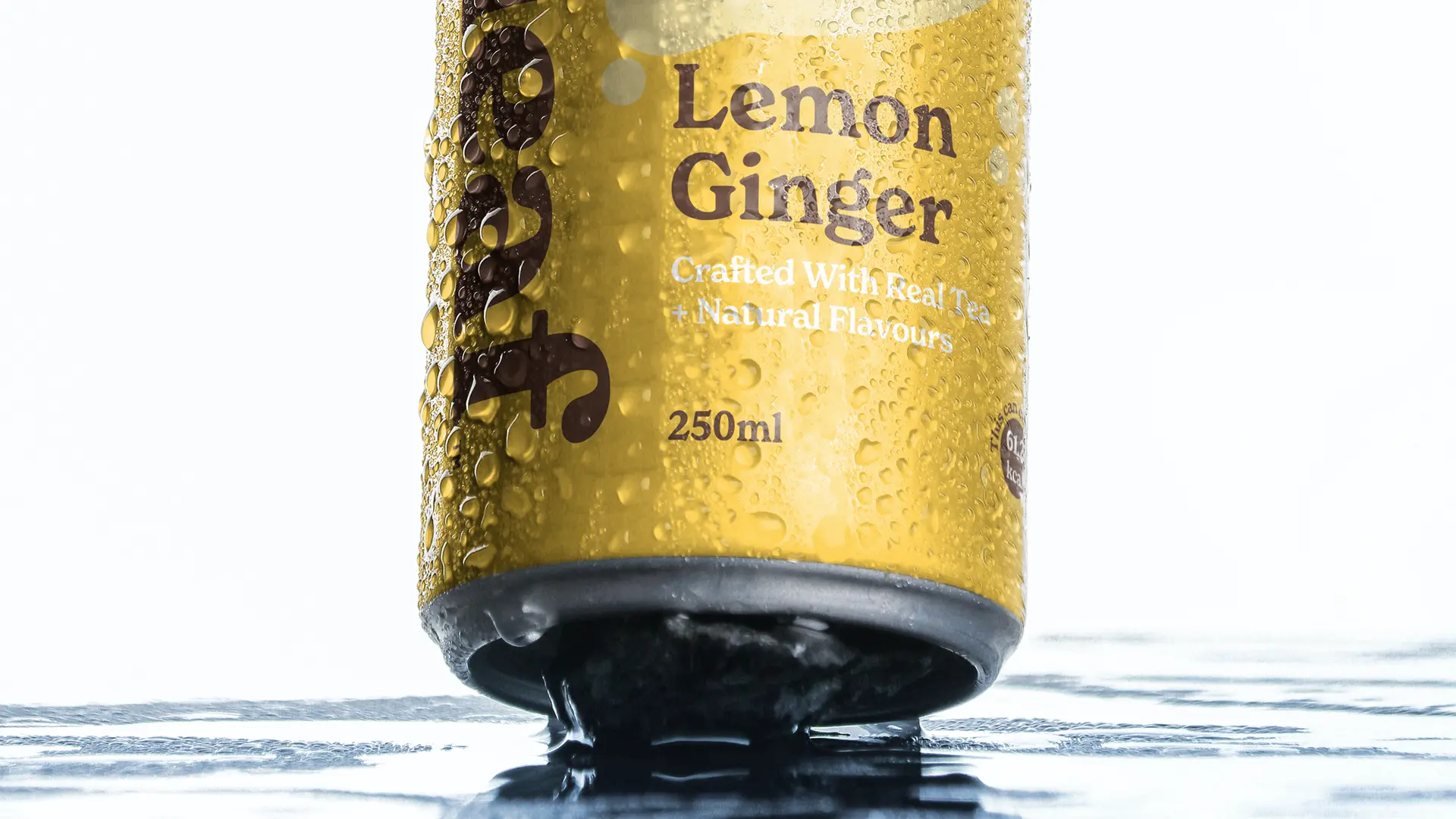
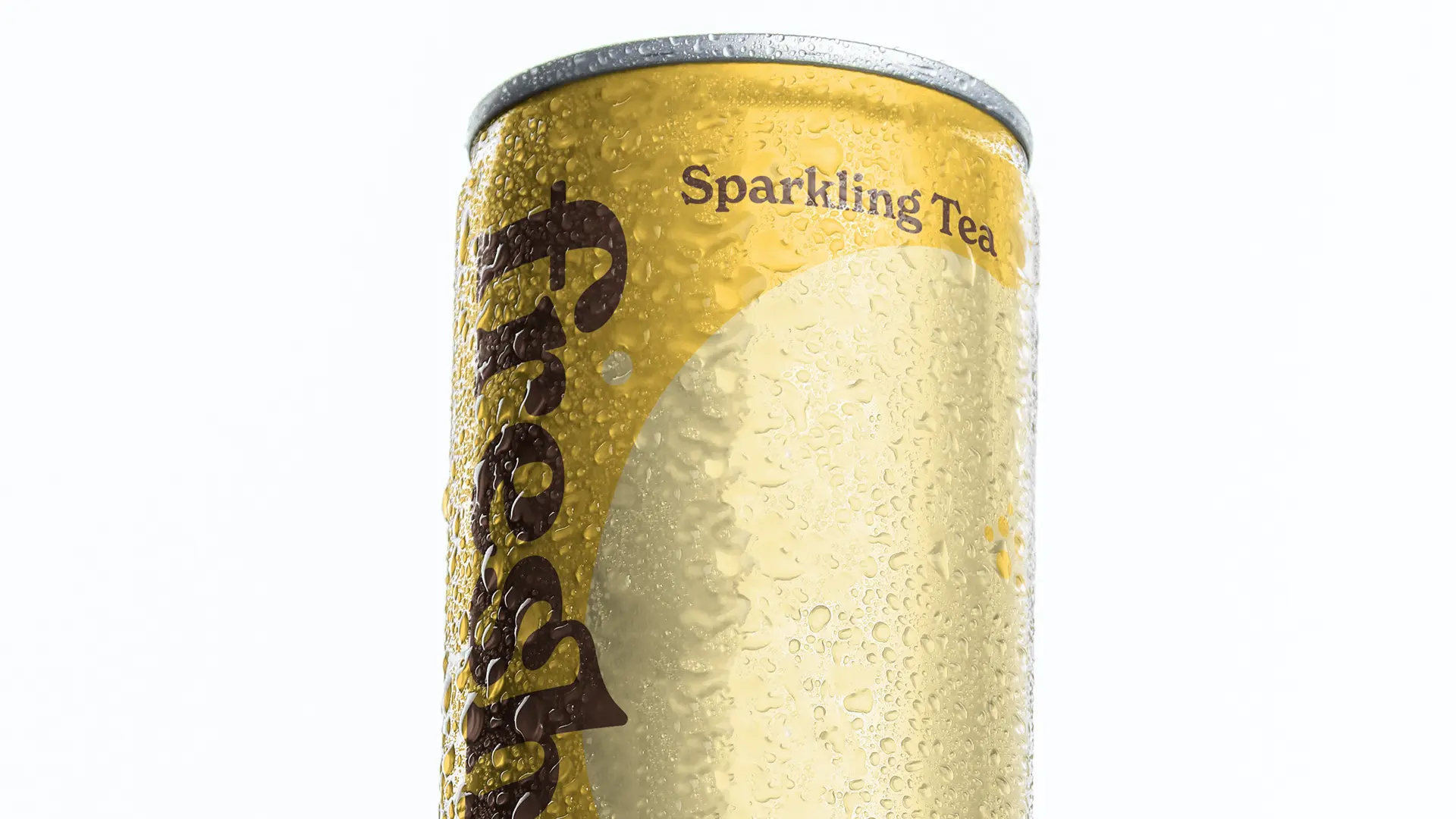
PACKAGING THAT TELLS A STORY
The can design for Freshleaf Sparkling Tea is more than just a container - it's a story waiting to be told. The matte finish provides a tactile experience that feels premium, while the vibrant colors ensure the product stands out in any setting. Subtle graphic elements, such as bubbles and flavor icons, add layers of fun and movement to the design, mirroring the fizzy, playful nature of the product.
On closer inspection, the design reveals thoughtful details that deepen the connection with the consumer. Gradients and minimal illustrations reflect the natural, sparkling essence of the tea, while carefully placed text ensures clarity and trust.
The inclusion of a hashtag on the can underscores the brand's digital-forward thinking, encouraging consumers to share their Freshleaf moments online. This small but strategic touch transforms the can into more than a product - it becomes a shareable experience.
SUSTAINABILITY AS A CORE VALUE
Freshleaf Sparkling Tea is designed for a generation that values transparency and sustainability. The brand's commitment to eco-conscious materials reflects its respect for both the environment and the audience it serves. Every design element, from the packaging to the messaging, reinforces the idea that Freshleaf is a brand that consumers can trust - not just for its flavors, but for its principles.
THE EMOTIONAL JOURNEY
Every interaction with Freshleaf Sparkling Tea - from seeing it on a shelf to holding it in your hand - has been designed to evoke emotion. The colors invite feelings of joy, calm, and nostalgia. The textures and graphics create curiosity and delight. The typography reassures and informs. This layered experience ensures that Freshleaf isn't just consumed; it's felt.
FRESH TAKES ON TRADITION
Freshleaf Sparkling Tea redefines what it means to enjoy tea. It transforms a drink steeped in heritage into a contemporary delight, speaking to a generation that seeks products as vibrant and dynamic as they are. By combining tradition with innovation, Freshleaf bridges the past and the future, offering a sparkling reminder that every moment - no matter how small - is worth celebrating.
Widarto Impact is proud to have brought this concept to life, demonstrating how strategic design can elevate a simple product into a compelling brand story. Explore the Freshleaf Sparkling Tea project and see how design becomes a spark for connection and celebration: