Elevating Dates Dairy with the Sweetness of Nostalgia
Elevating Dates Dairy with the Sweetness of Nostalgia
Ouma is a brand concept that celebrates the natural richness of Medjool dates and the creamy indulgence of premium dairy. Designed to evoke warmth, joy, and a sense of nostalgia, Ouma redefines what it means to enjoy wholesome, functional beverages. Under the creative direction of Eko Widarto, the brand's identity and packaging design seamlessly blend traditional comfort with modern aesthetics, creating a product that resonates deeply with health-conscious and design-savvy audiences.
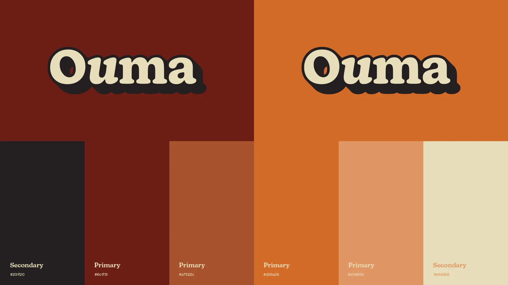
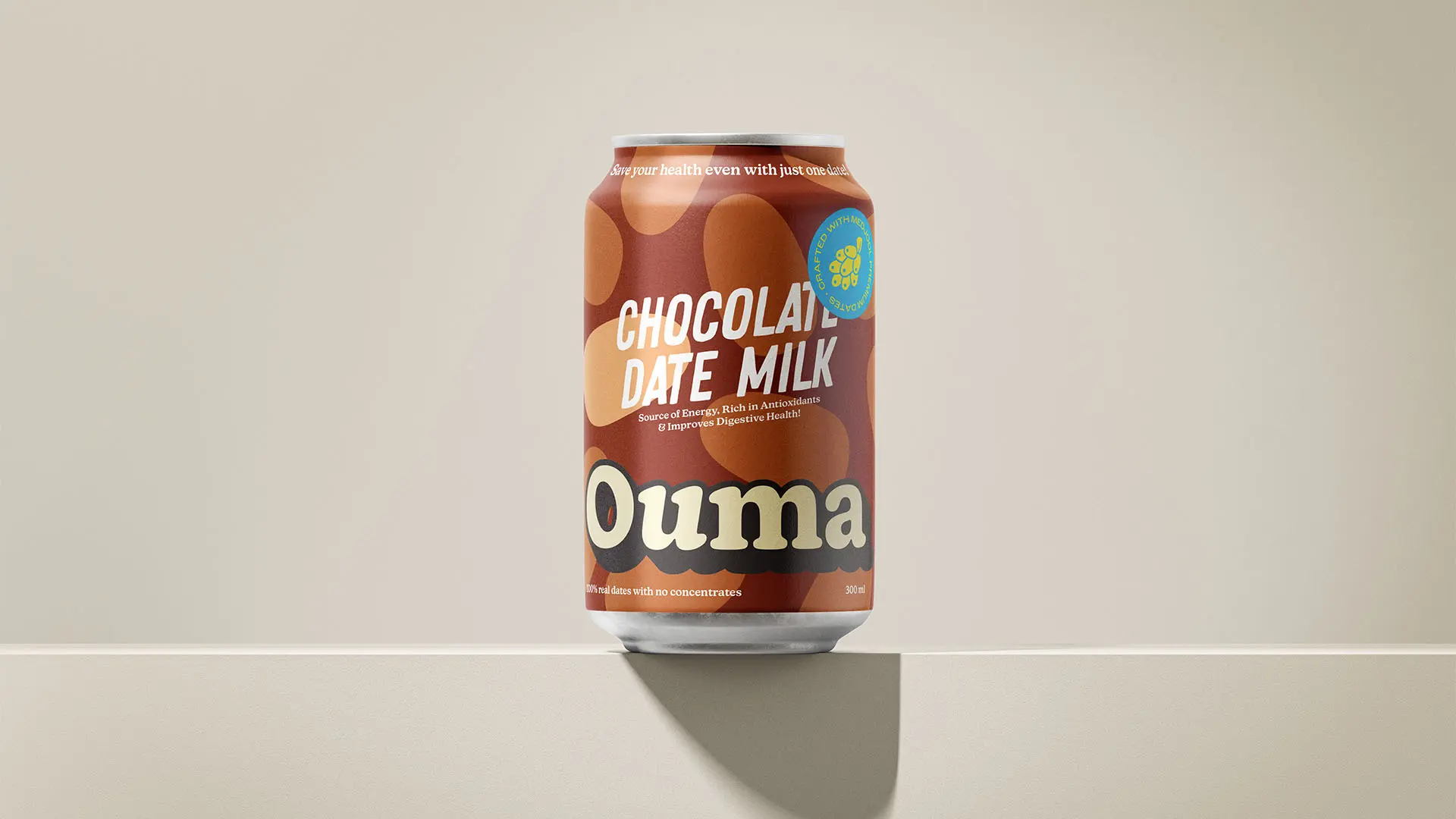
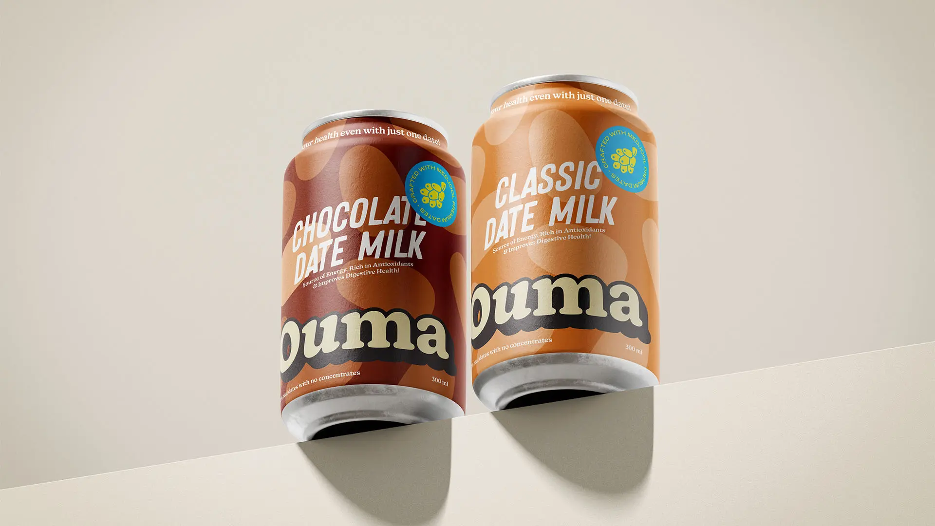
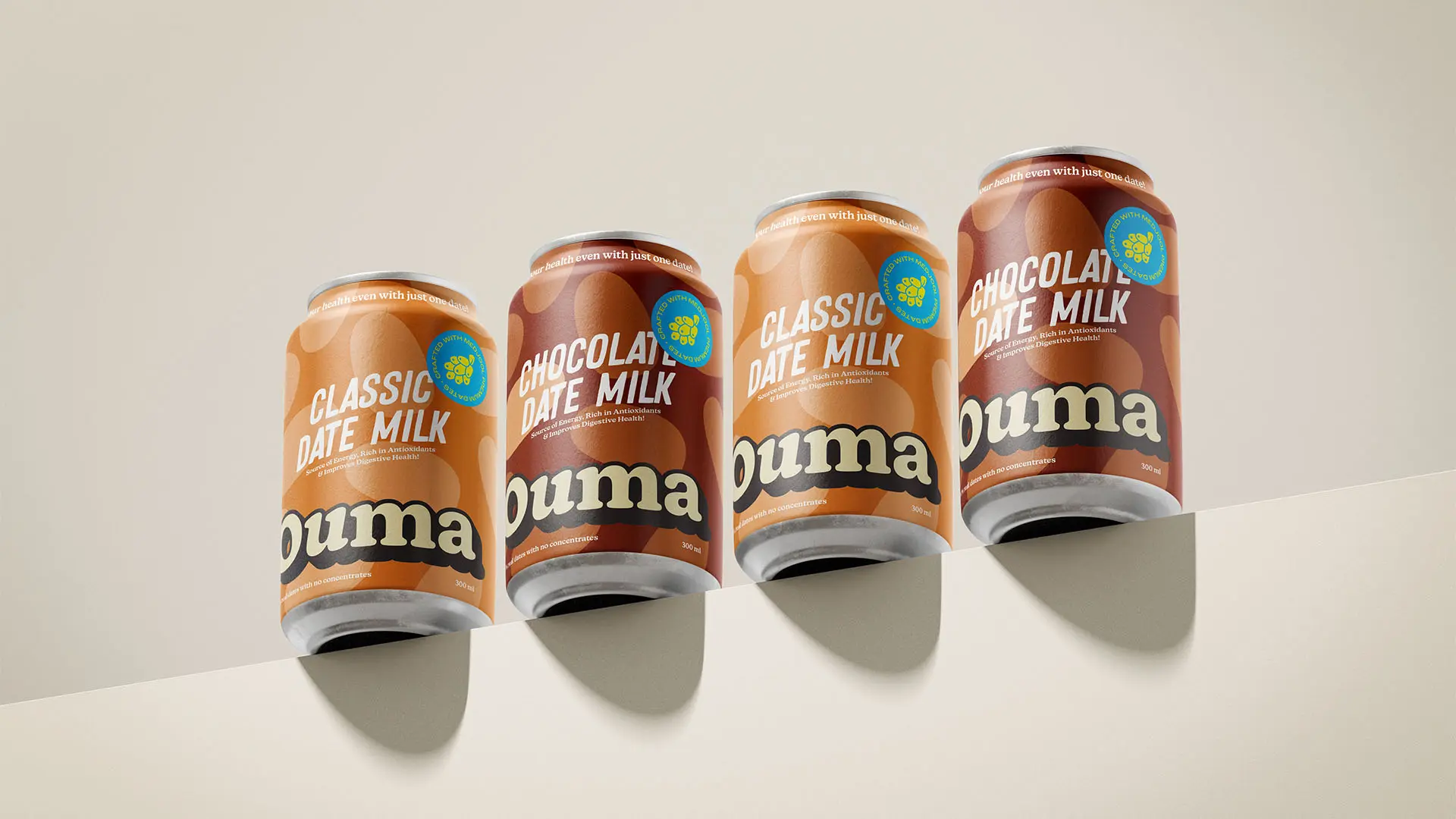
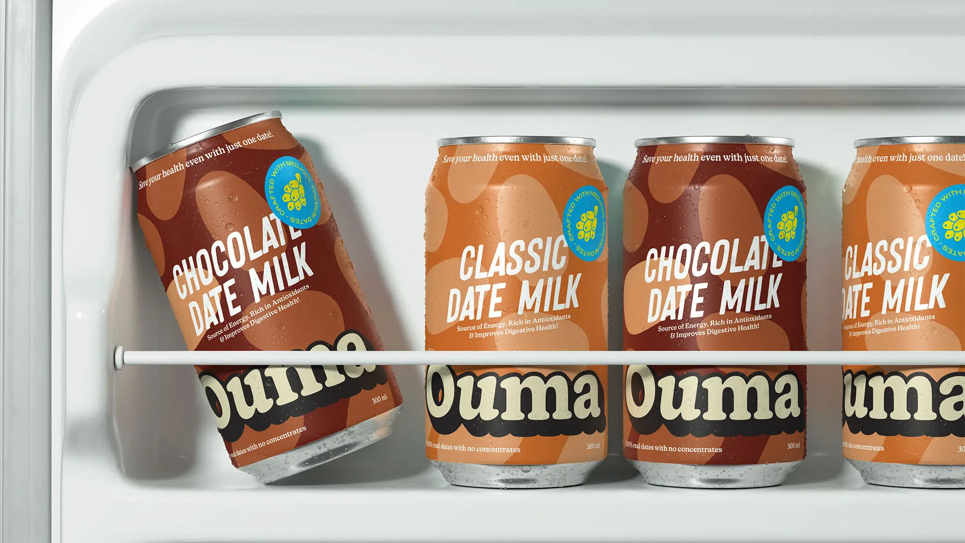
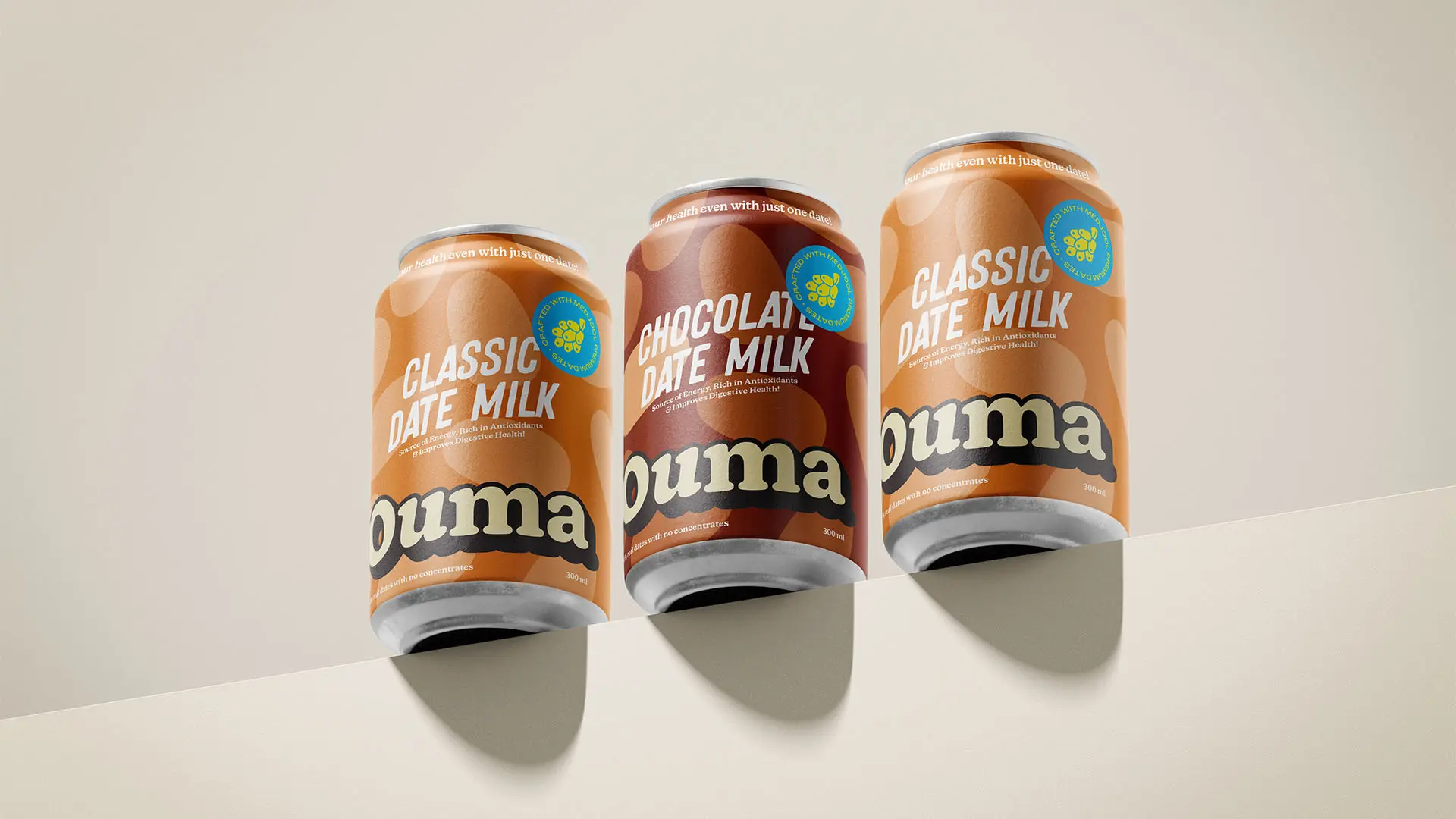
The design approach begins with a carefully curated color palette, inspired by the earthy tones of dates and the softness of dairy. Shades like deep amber, rich chocolate, and creamy beige form the foundation of the visual language, evoking a sense of natural indulgence and authenticity. Each flavor variant's such as Classic and Chocolate Date Milk's features unique accent tones that ensure differentiation while maintaining a cohesive brand identity. These colors are chosen not just for their aesthetic appeal but for their ability to create an emotional connection, making the packaging feel familiar and approachable.
Typography plays a pivotal role in expressing Ouma's personality. The brand's logo, set in a custom serif font, features soft, rounded edges that evoke playfulness and nostalgia. This is balanced by a modern sans-serif typeface for supporting text, ensuring readability and versatility across platforms. This typographic combination creates a harmonious blend of tradition and modernity, perfectly reflecting Ouma's core values of authenticity and innovation.
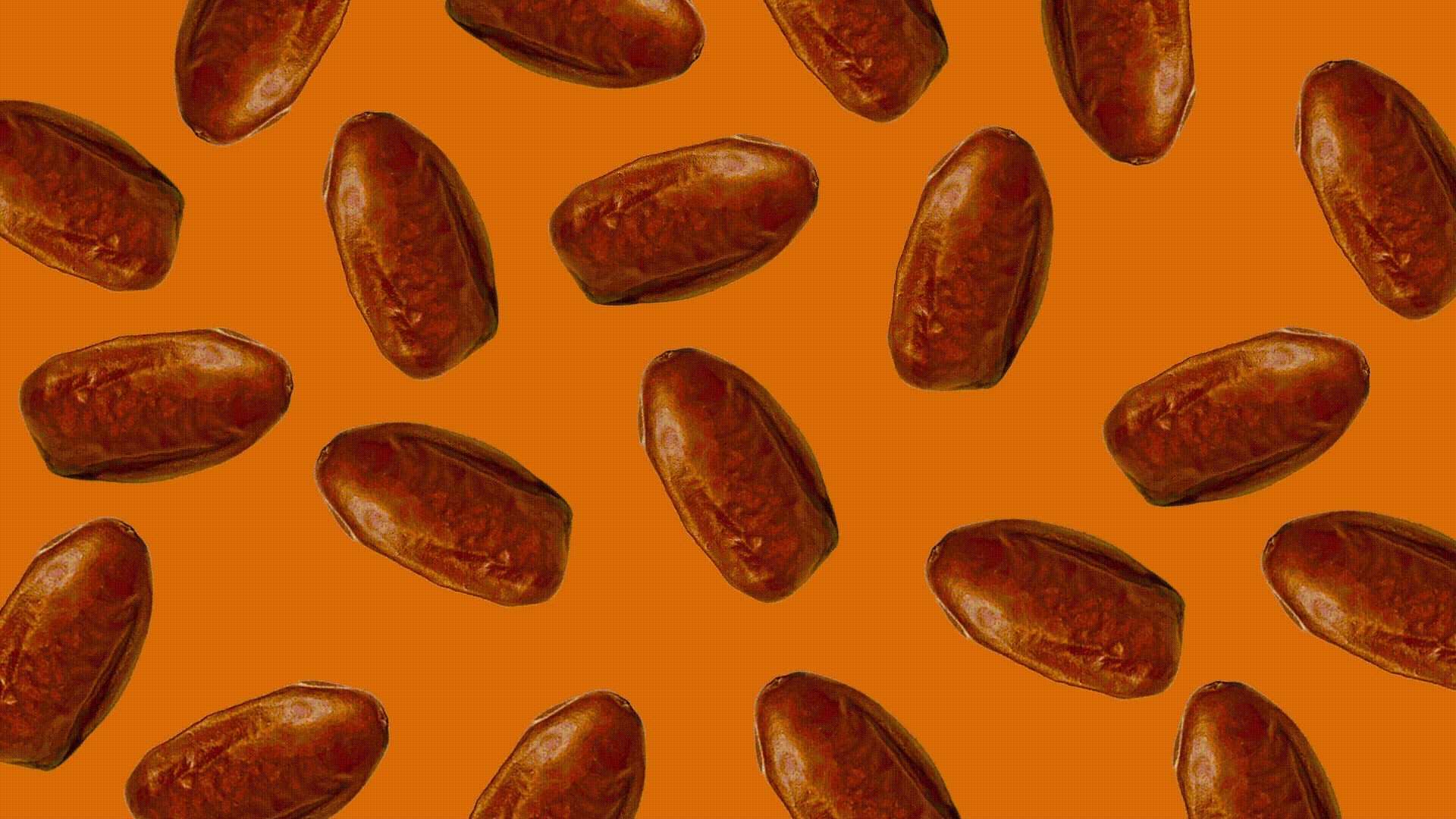
The packaging design also integrates illustrations of Medjool dates, creating patterns that highlight the product's natural ingredients while adding a playful touch. These illustrations serve both decorative and storytelling purposes, reinforcing the brand's commitment to wholesome simplicity. To enhance the tactile experience, the packaging features a matte finish with subtle gloss accents, delivering a premium feel that aligns with consumer expectations of quality.
Strategically, Ouma positions itself as more than just a dairy product'ss a sensory experience that combines nutrition, flavor, and emotional connection. The inclusion of a QR code on the packaging bridges the gap between physical and digital engagement, offering consumers access to recipes, brand stories, and additional product information. This interactive layer enhances brand loyalty and aligns with the needs of modern, tech-savvy consumers.
Through thoughtful design and strategic storytelling, Ouma elevates dates dairy to a new level, transforming a functional beverage into a heartfelt brand experience. Under Eko Widarto's creative direction, Ouma captures the sweetness of nostalgia while embracing the innovation of contemporary design, making it a standout choice in the growing market for natural, health-focused products.