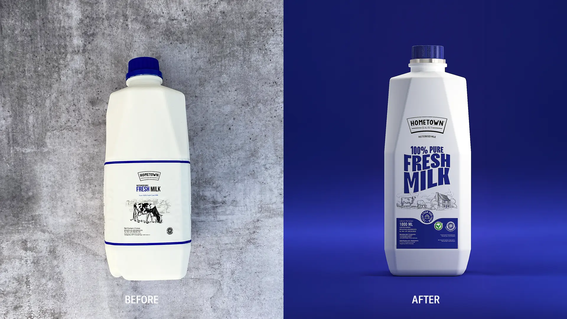
HomeTown Dairy has always been committed to delivering freshness, sourcing its milk directly from farms and ensuring minimal pasteurization to preserve its natural quality. This dedication to authenticity sets the brand apart in a market dominated by industrialized dairy products. However, despite its superior product, HomeTown faced a significant challenge: its packaging was not telling this story. The design lacked the visual impact needed to stand out on crowded supermarket shelves, making it difficult for consumers to connect with the brand's unique farm-to-table promise.
Widarto Impact was brought in to reimagine HomeTown's packaging, creating a design that would communicate the brand's authenticity and quality while capturing consumer attention. The goal was clear: translate HomeTown's core values into a bold, fresh look that resonated with the modern shopper.
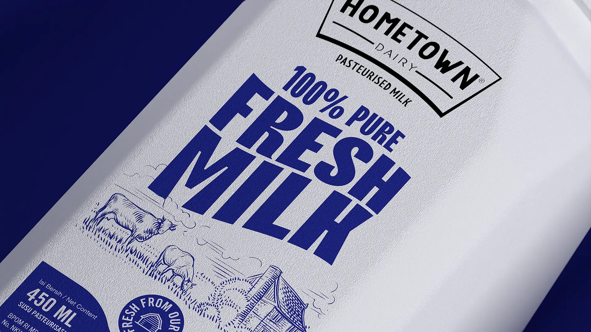
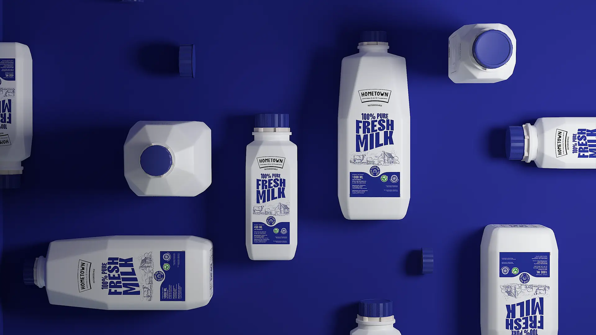
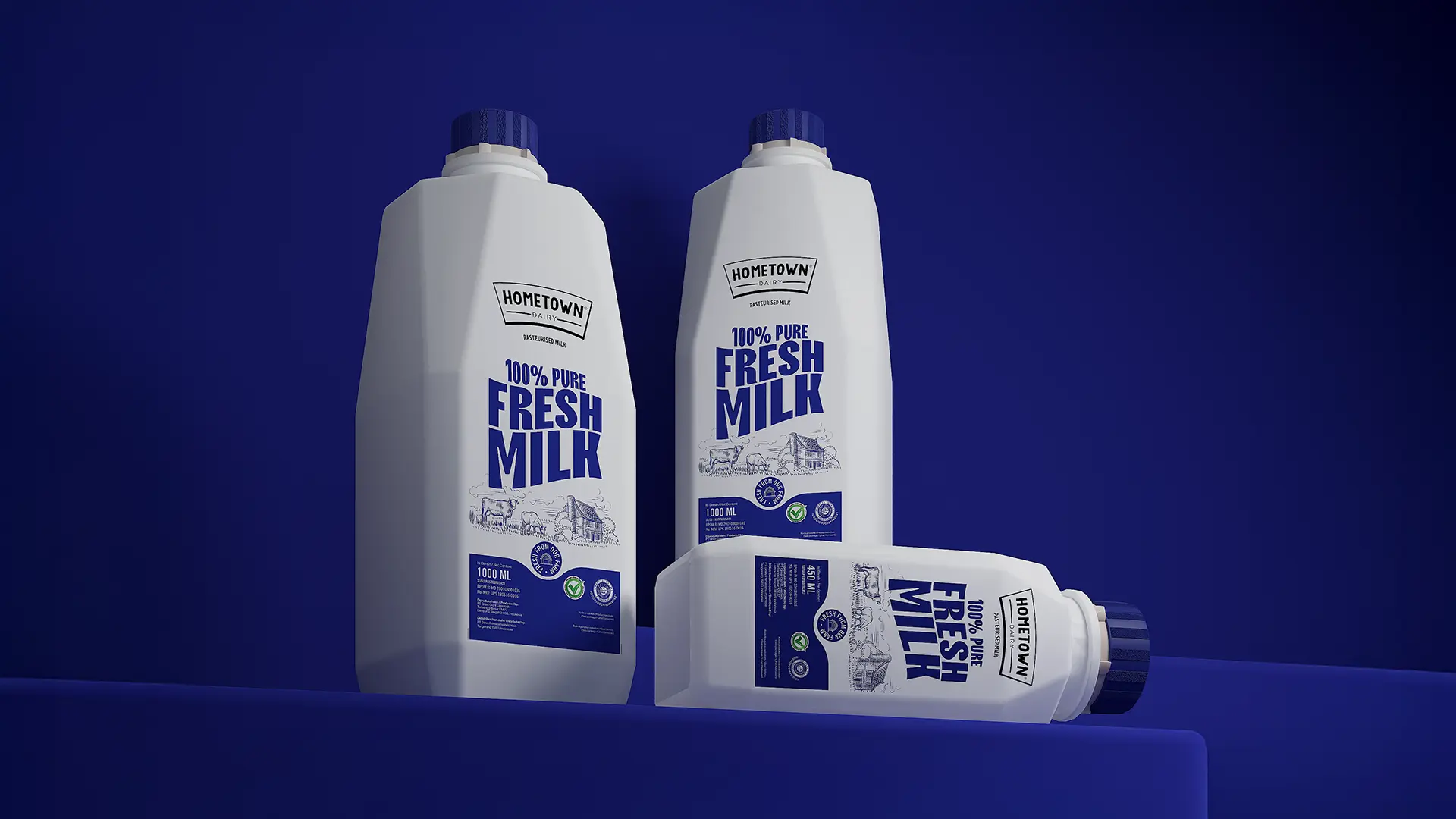
The redesign centers on HomeTown's most compelling narrative - freshness directly from the farm. Custom illustrations of cows, barns, and pastoral landscapes were introduced, creating a visual link to the brand's origins. These hand-drawn elements evoke trust and tradition, inviting consumers to feel a connection to HomeTown's honest farming practices. The illustrations are paired with a clean, modern layout that balances nostalgia with contemporary appeal, ensuring the packaging speaks to both heritage and premium quality.
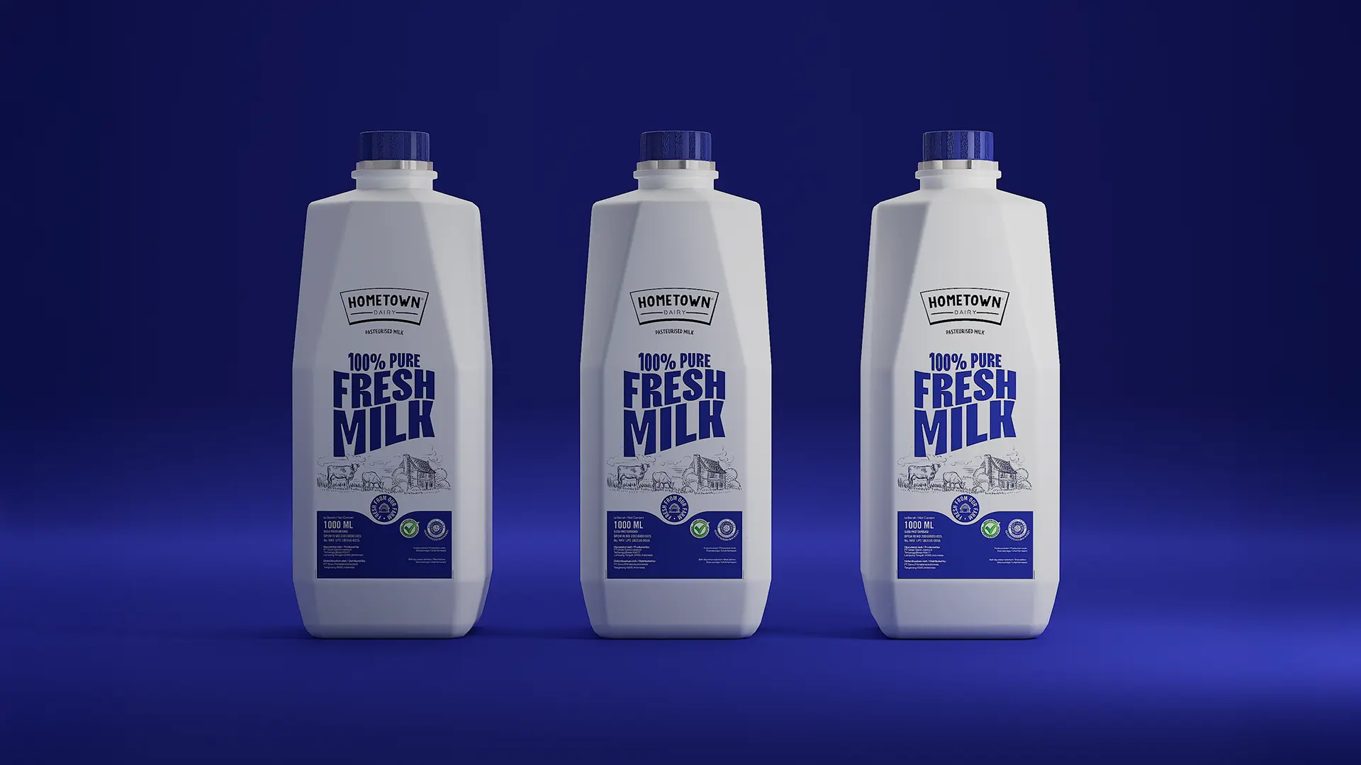
At the heart of the new design is a bold typographic lockup that declares "100% PURE FRESH MILK." This statement, set in dynamic and approachable lettering, immediately conveys HomeTown's key promise. The typography is designed to stand out, ensuring the product's benefits are understood at first glance. This clarity is complemented by the strategic use of color. A vibrant, modern blue was chosen as the cornerstone of the brand's visual identity, symbolizing trust, freshness, and cleanliness. Paired with crisp white, the color palette enhances shelf visibility while reinforcing the product's premium positioning.
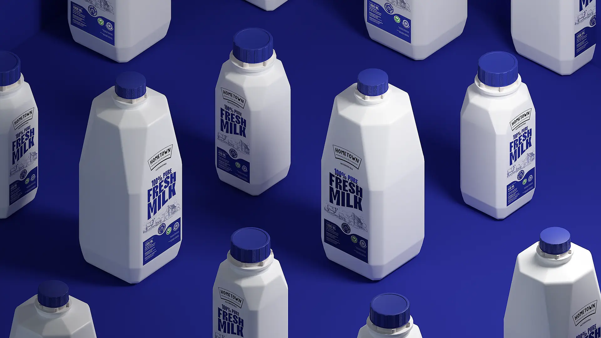
The packaging layout was restructured to prioritize clarity and scalability. The HomeTown logo takes pride of place at the top, followed by bold messaging at the center, and quality seals and certifications at the bottom. This hierarchy ensures the design is easy to navigate while providing flexibility for future product extensions.
The result is a packaging design that is both beautiful and strategic. Every detail, from the hand-drawn illustrations to the vibrant blue color, works together to tell HomeTown's story of authenticity and quality. The redesign bridges the gap between the brand's roots in traditional farming and the expectations of today's discerning consumers, positioning HomeTown as a trusted choice on supermarket shelves.
With its fresh new look, HomeTown Dairy is ready to win hearts and stand out, bringing its farm-to-table promise to life for a modern audience.
"HomeTown Dairy isn't just another milk brand - it's a promise of freshness and authenticity". With this redesign, we wanted to bring the story of the farm to the forefront, ensuring every consumer knows that HomeTown milk comes from a place of care, quality, and trust. The result is a design that not only looks striking but also feels honest and connected to the roots of traditional dairy farming. - Eko Widarto, Creative Director