COTD (Coffee Of The Day): A Bold Approach to Everyday Coffee
The coffee beverage market continues to experience remarkable growth, fueled by the rise of social media as a central aspect of modern life. While this has created new opportunities for business owners to launch brands and market products, it has also saturated the market with an overwhelming variety of options. For consumers, this abundance makes finding the right coffee more challenging than ever. In the competitive cold brew category, the stakes are even higher: brands must cut through the noise and become instantly recognizable, especially on social media, where visual appeal and shareability drive buying decisions.
A Clear Mission: Stand Out or Fade Away
With new brands entering the scene daily, it's easy to fall into the trap of blending in. Generic design and messaging are surefire ways to make a brand forgettable. At COTD, we believe in bold, minimalist strategies that break through the clutter. Our approach centers on simplicity, clarity, and instant recognition - a visual and emotional identity that makes an impact at first glance.
Name as Strategy: Coffee of the Day (COTD)
The foundation of COTD's identity is its name, an acronym derived from the phrase "Coffee of the Day" Short, memorable, and effortlessly cool, the name encapsulates the essence of the brand; coffee that fits seamlessly into everyday life. Whether it's an energizing cold brew for a morning commute or a mid-afternoon pick-me-up, COTD is designed to be a versatile companion, offering a sense of familiarity and quality wherever it's enjoyed.
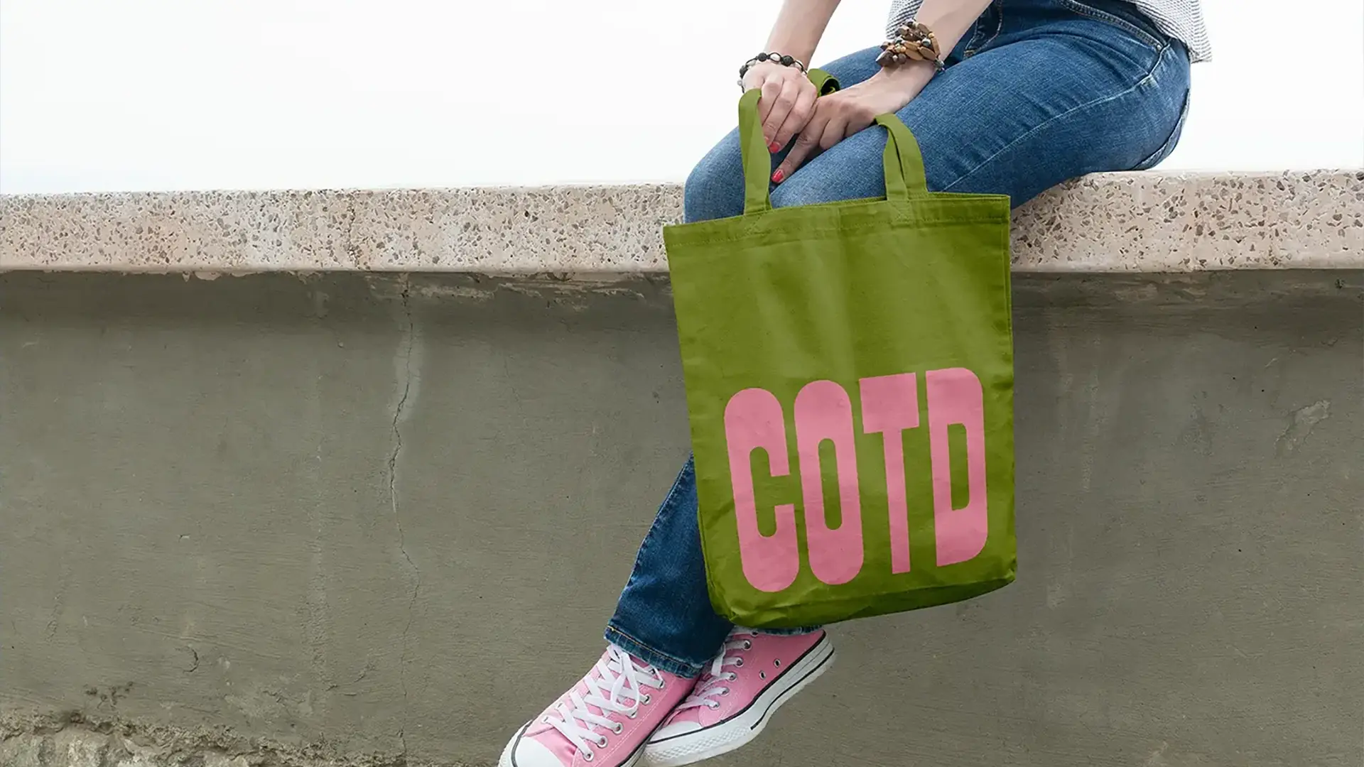
But COTD is more than just a coffee brand; it's a lifestyle. Beyond beverages, the brand extends its identity to merchandise like t-shirts and hats, inviting customers to integrate COTD into their daily routines as both a drink and a cultural statement.
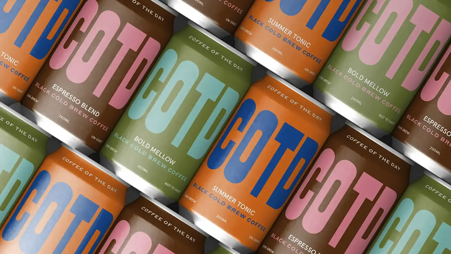
Designing Simplicity: A Wordmark That Works
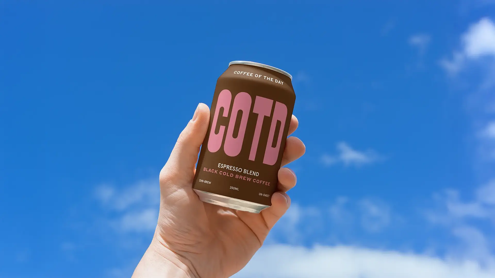
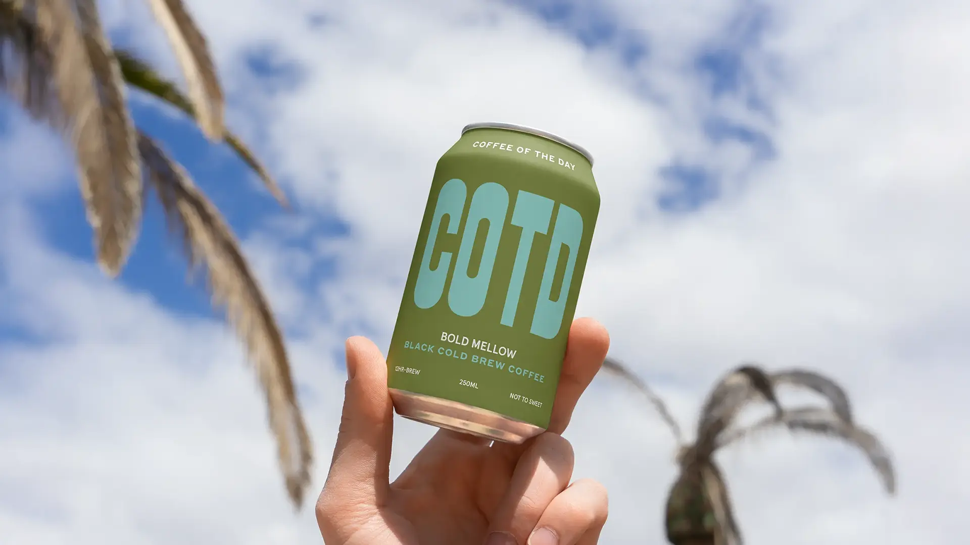
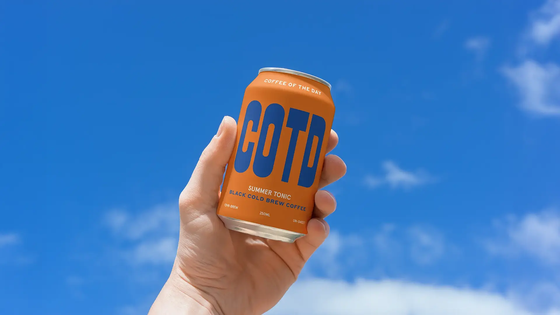
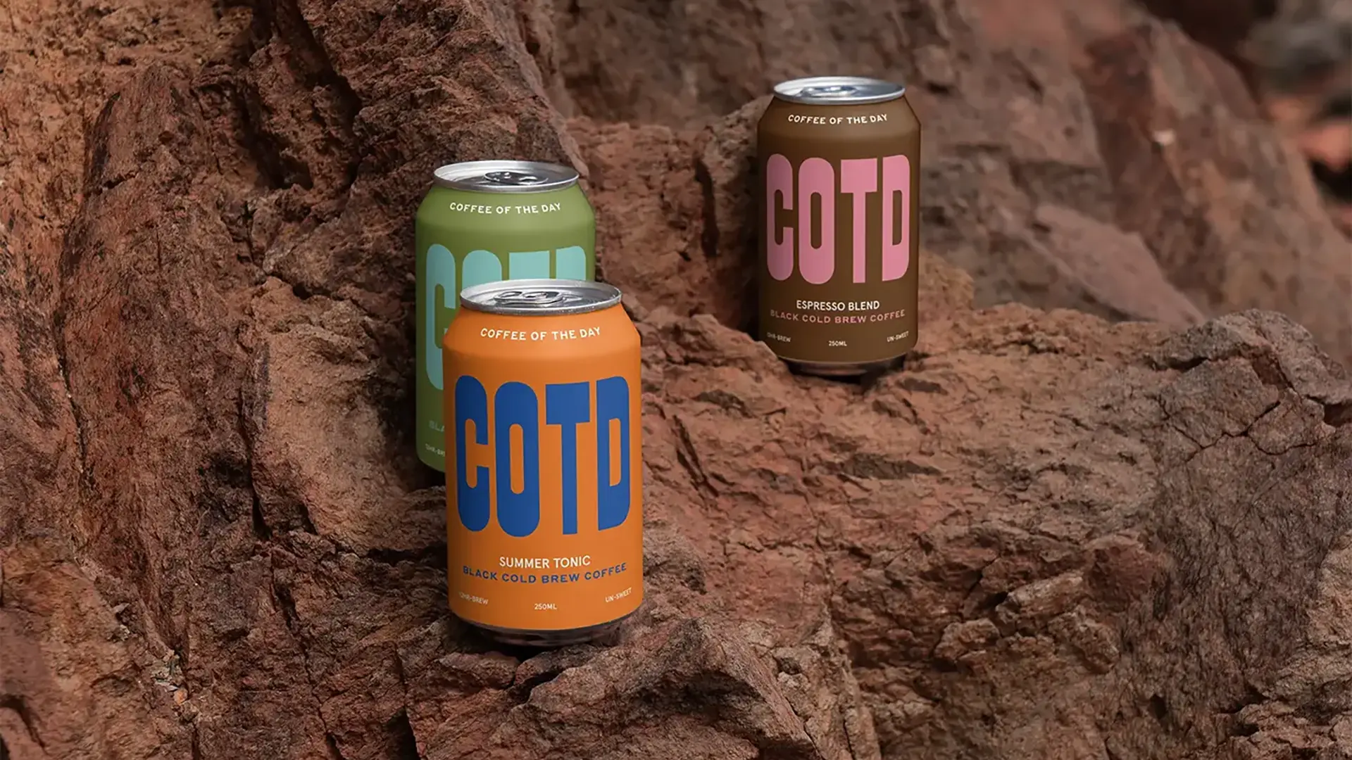
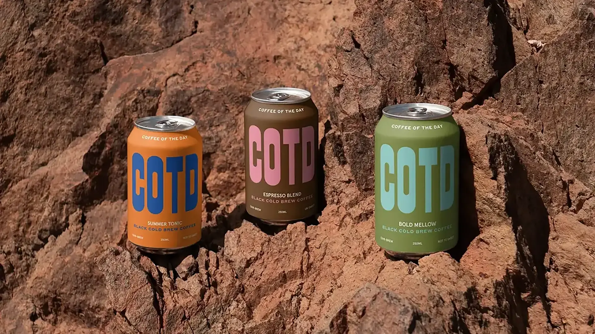
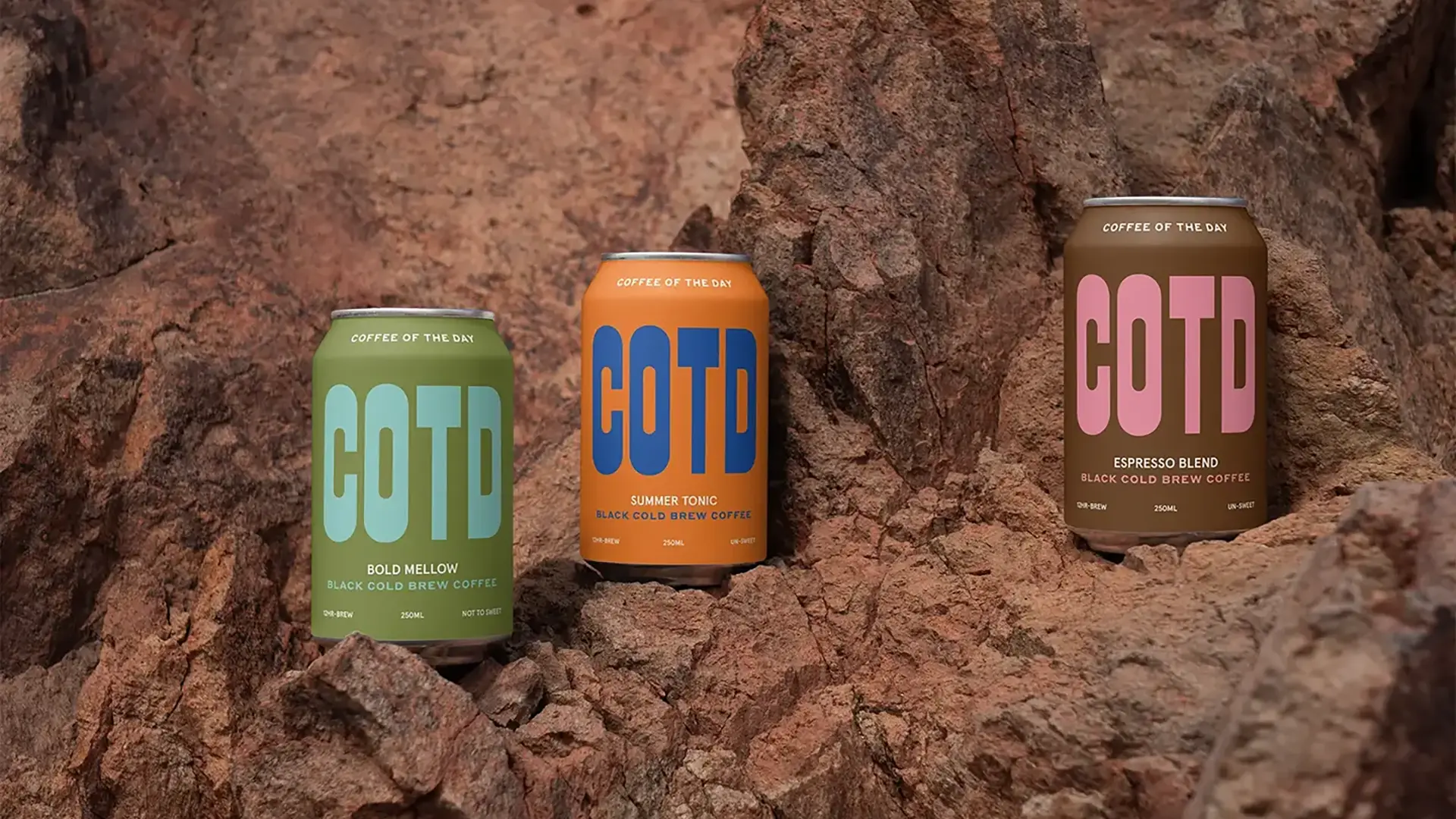
At the heart of COTD's visual identity is a dynamic wordmark. The logotype is intentionally simple, bold, and timeless - qualities that ensure it remains relevant across evolving trends. The clean typography aligns with the brand's mission to be clear and easily recognizable, reflecting its values of modernity and accessibility.
Complementing the wordmark is the can design, which relies on a minimalist layout and strategic color combinations. The result is a clean, lively aesthetic that stands out on store shelves and social media feeds alike. Every element of the design is tailored to enhance the brand's impact, from its bold logo to the simplicity of its packaging, creating a cohesive and memorable visual language.
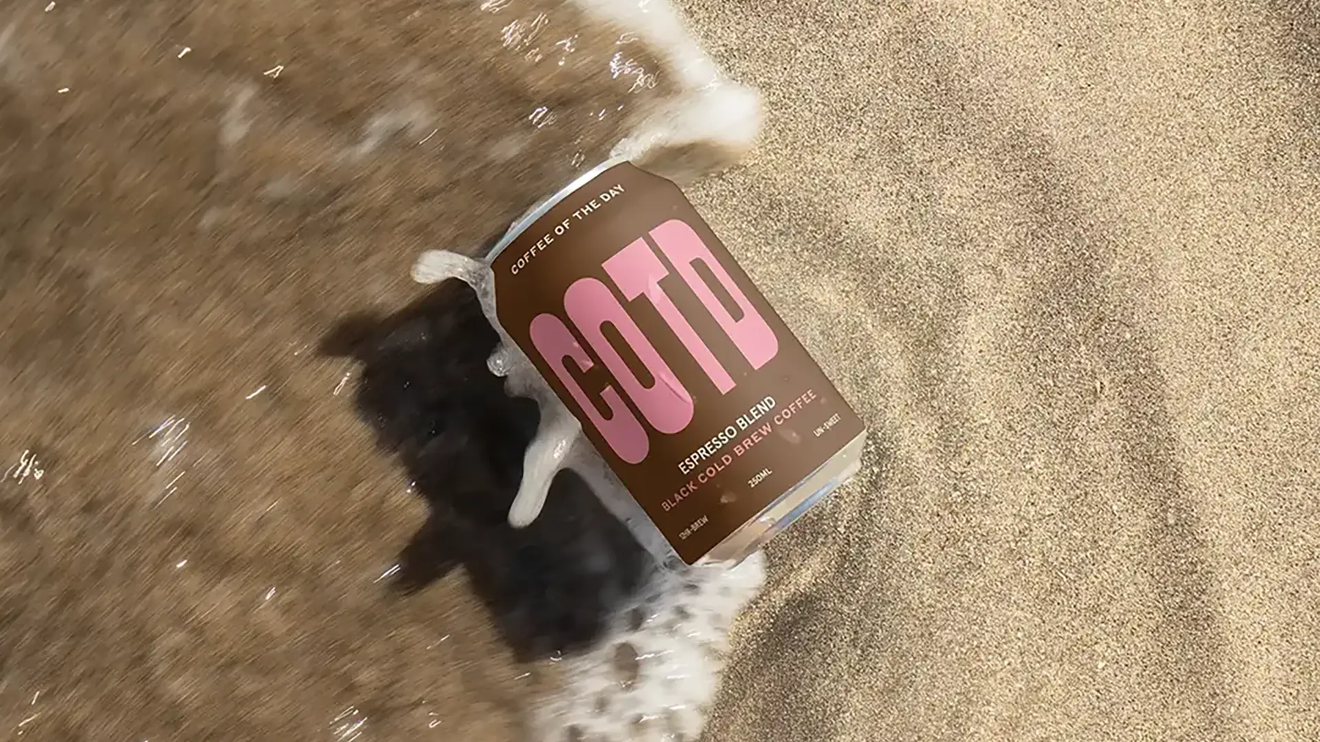
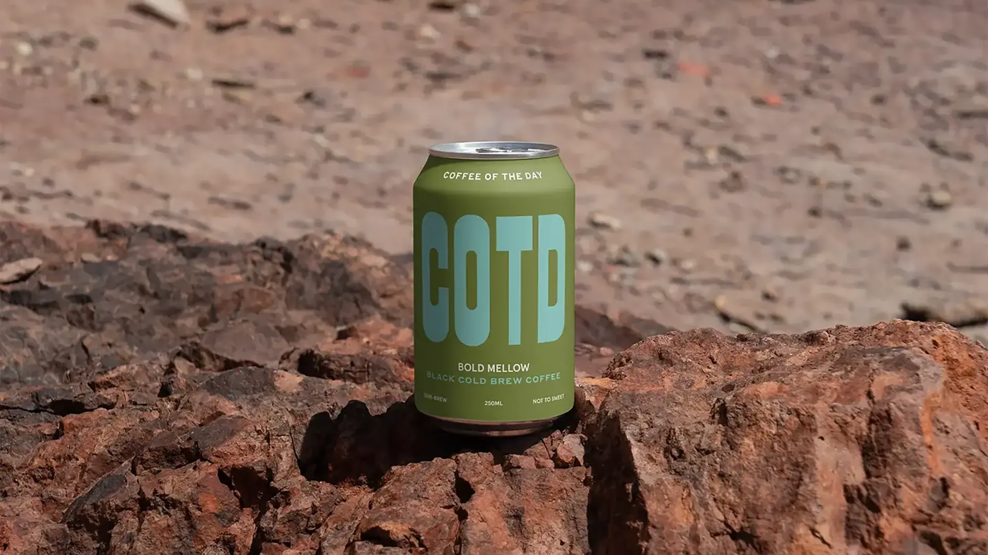
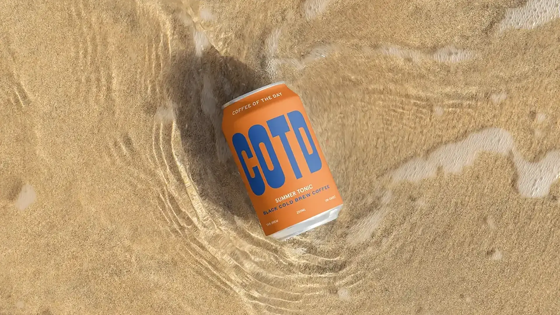
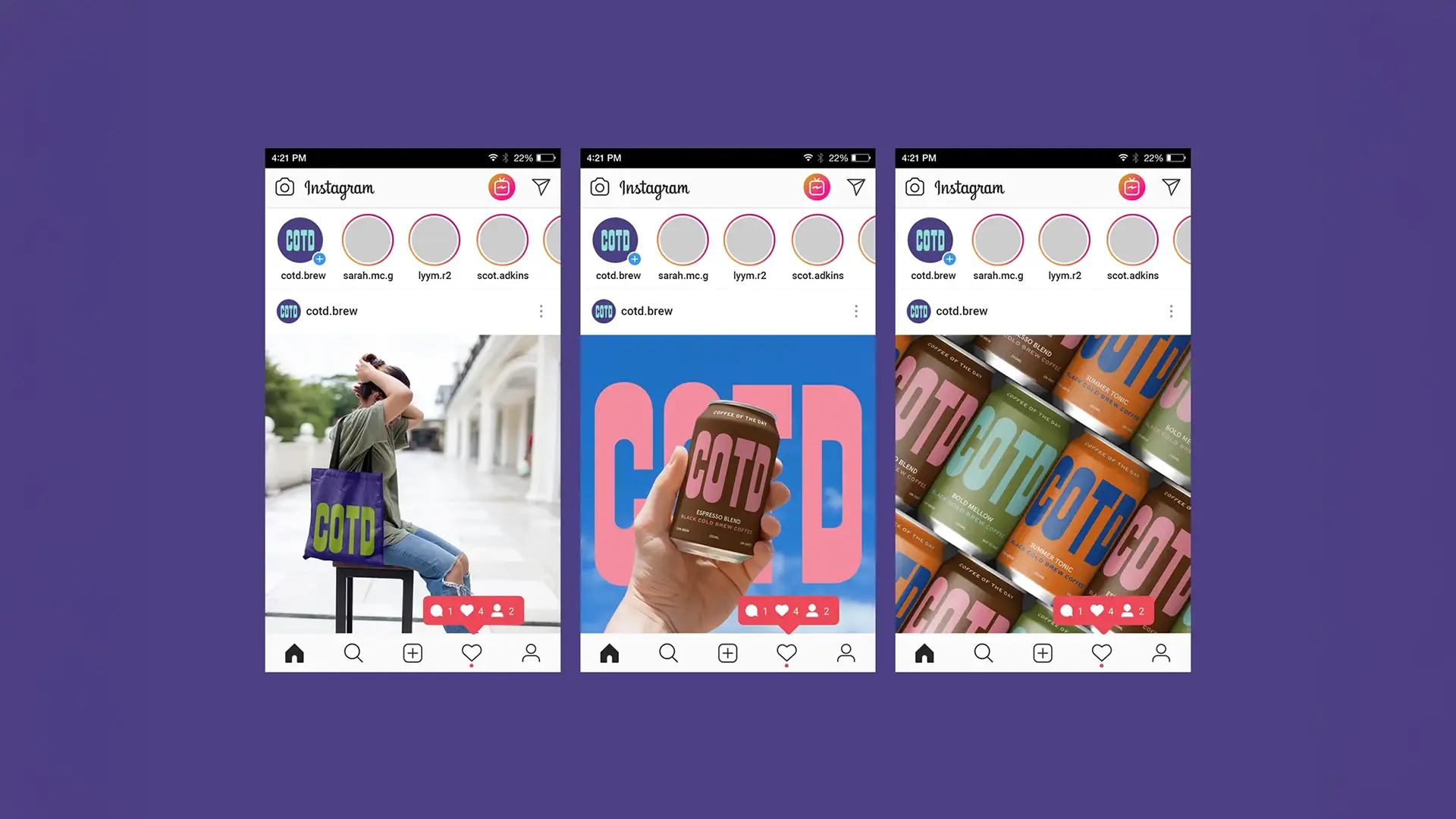
COTD: A Brand for the Social Media Era
COTD was created with a deep understanding of how consumers engage with brands today. Social media is no longer just a marketing tool; it's an integral part of the customer journey. COTD leverages this by offering a product that is as shareable as it is enjoyable. Its clean, modern design and bold identity make it the perfect candidate for Instagram-worthy moments, turning every interaction into an opportunity for organic brand growth.
This project reflects Widarto Impact's strategic approach to addressing the challenges of today's competitive beverage market, empowering FMCG brands to stand out, grow, and make a lasting impact.