BINO
Repositioning a Malaysian chocolate brand through a distinctive identity and packaging system designed to strengthen shelf presence, build recognition, and support growth into new markets.

Making Indulgence Unmistakable
A new identity for a Malaysian chocolate brand with ambitions beyond its home market.
OVERVIEW
BINO is a Malaysian brand that turns real ingredients into generous chocolate indulgence.
The products were already rich in flavour and full of character. The identity, however, did not express those qualities with the same confidence. BINO needed a clearer and more distinctive presence, one that could strengthen its position locally while preparing the brand for a wider international audience.
CHALLENGE
BINO made chocolate people loved, but its identity was not working as hard as its product.
Its previous expression felt familiar within the confectionery category. It lacked the presence needed to stand apart from established local and international brands, and did not fully reflect the quality of the ingredients or the generous nature of the product.
Our challenge was to give BINO a more distinctive point of view while preserving its approachable character. The identity needed to feel joyful and premium, without becoming childish or overly polished.
It also had to work as a practical commercial system. BINO needed stronger recognition on shelf, greater consistency across the range, and enough flexibility to support new products, gifting, and future markets.
SOLUTION
Widarto Impact repositioned BINO around the idea of generous enjoyment.
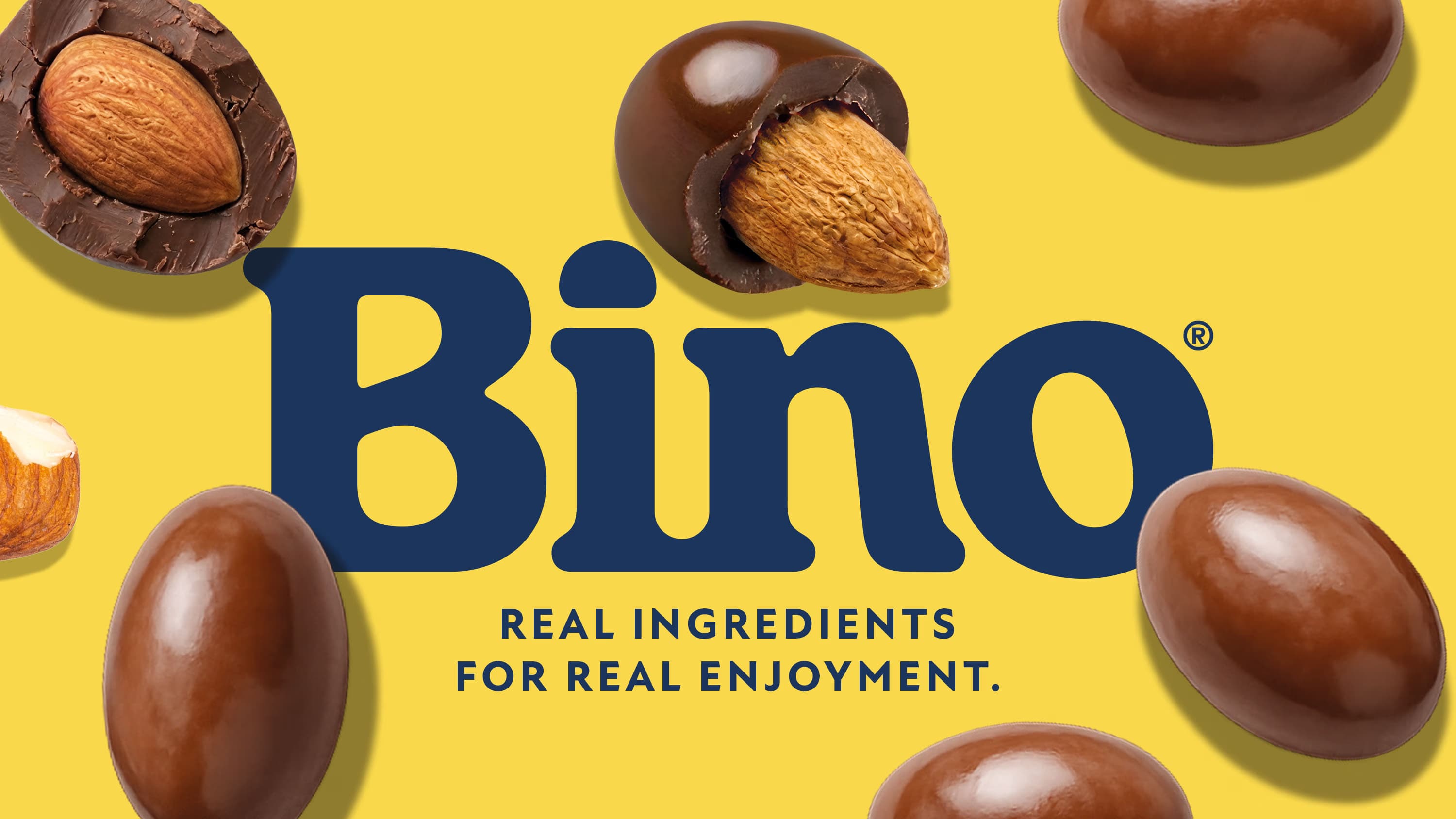
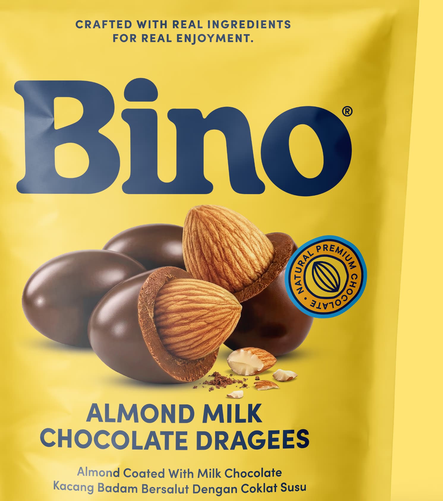
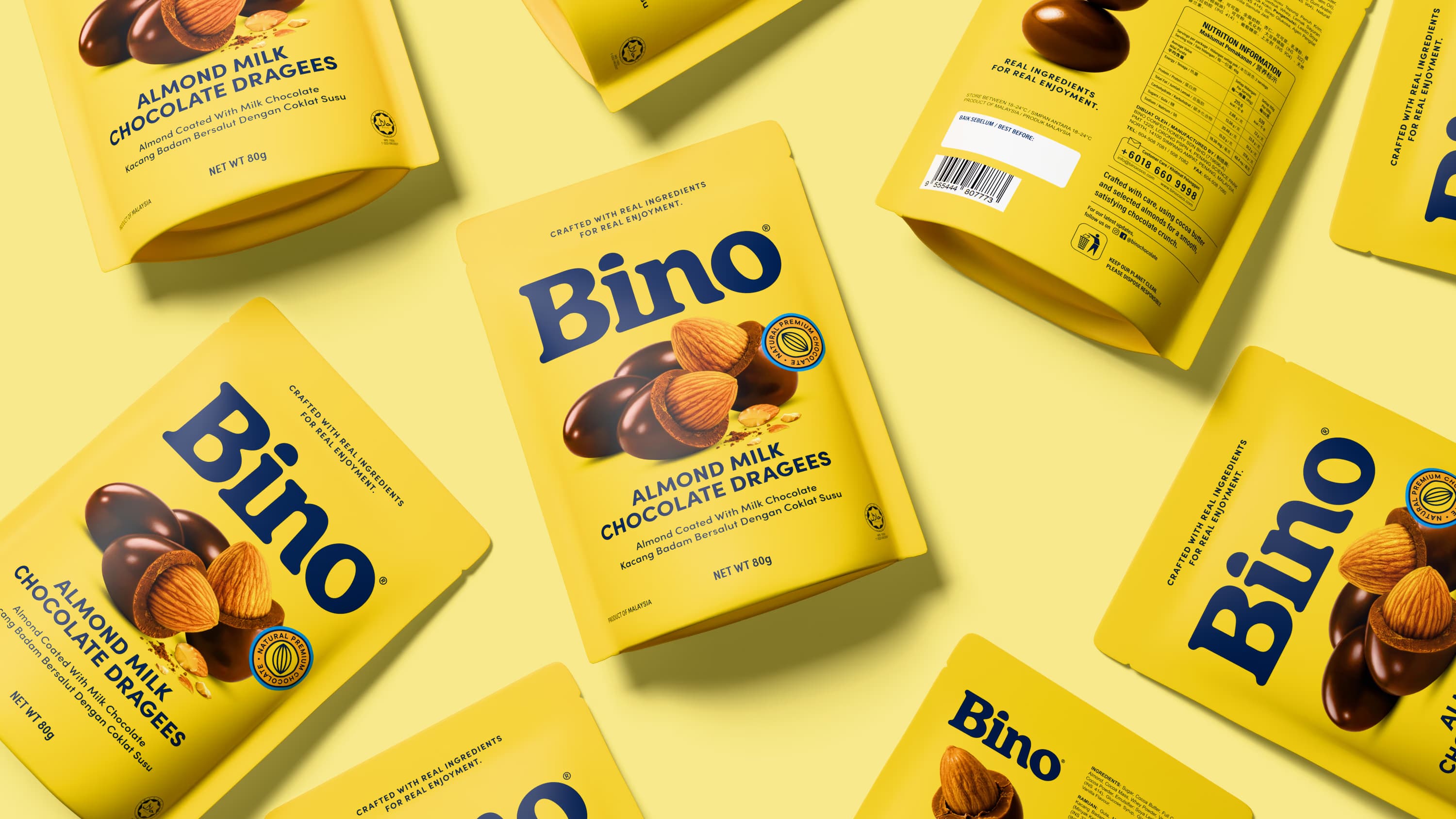
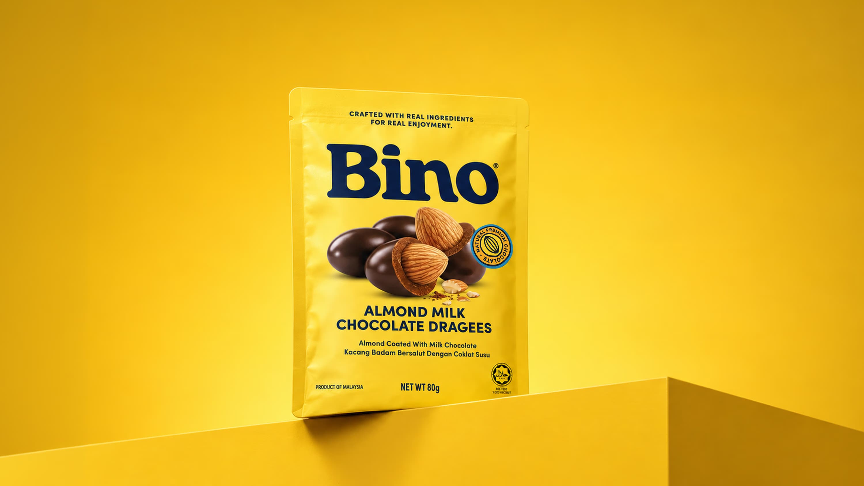
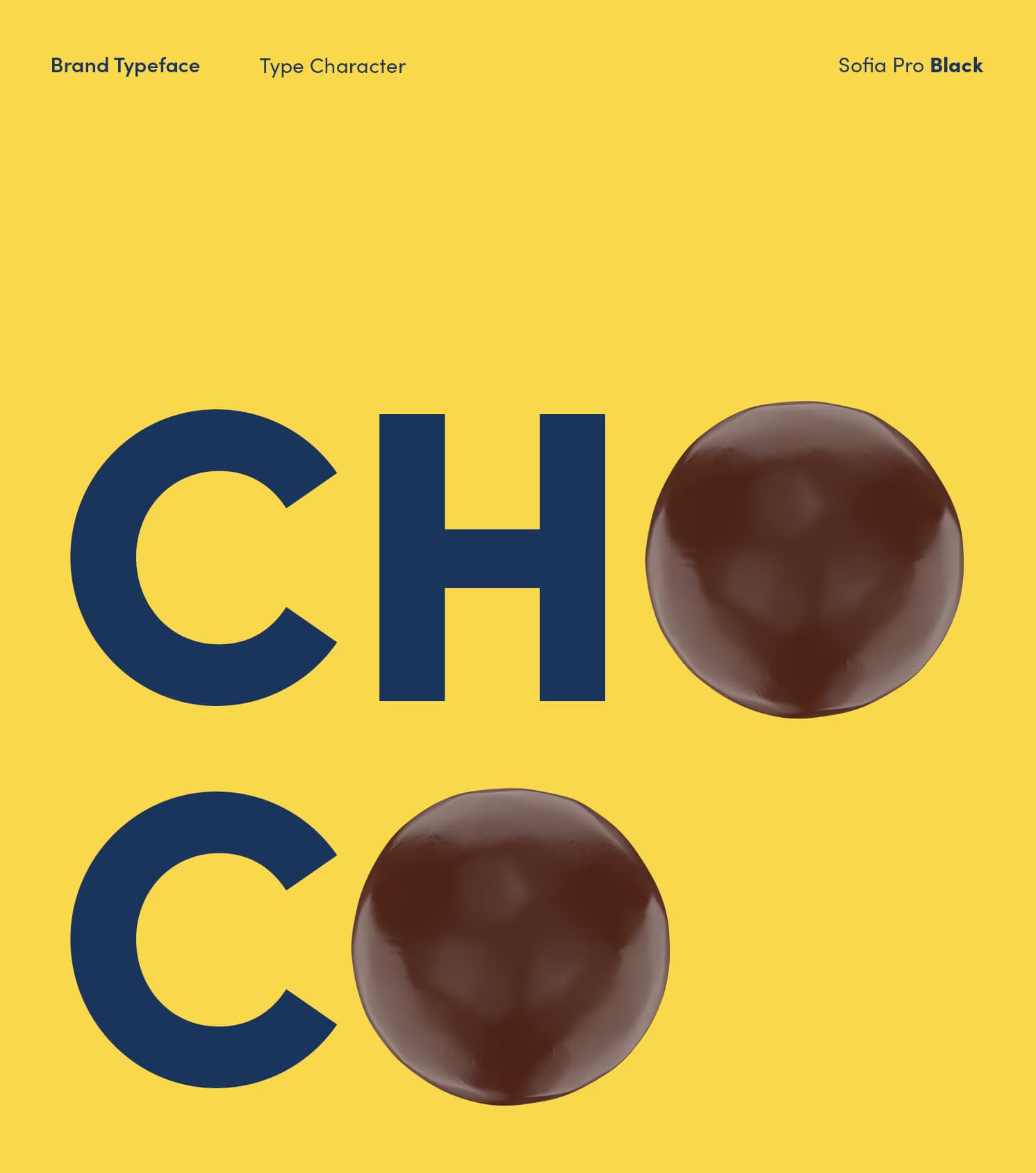
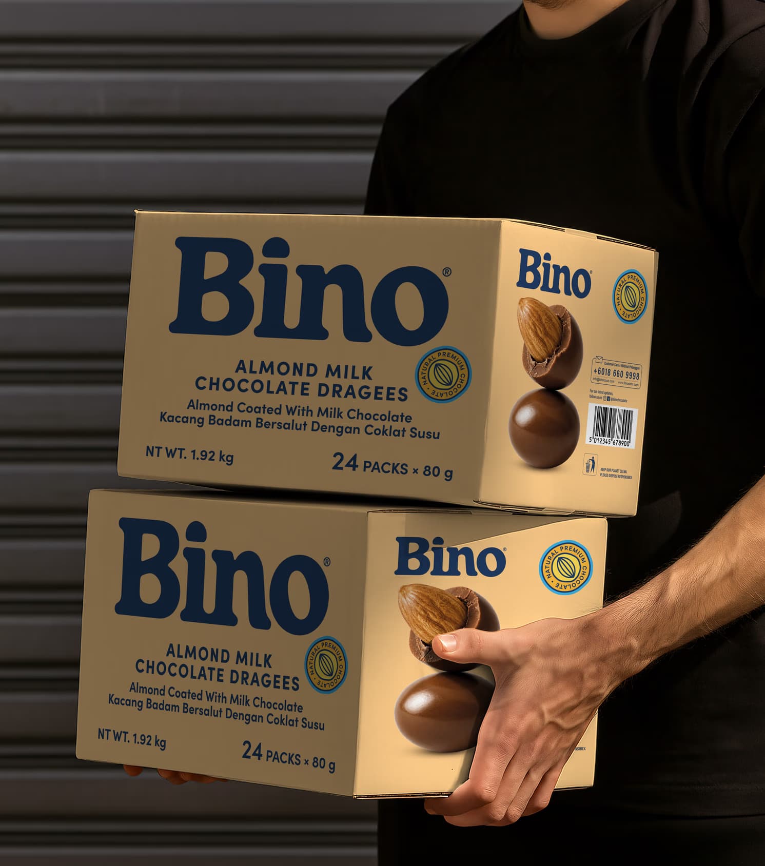
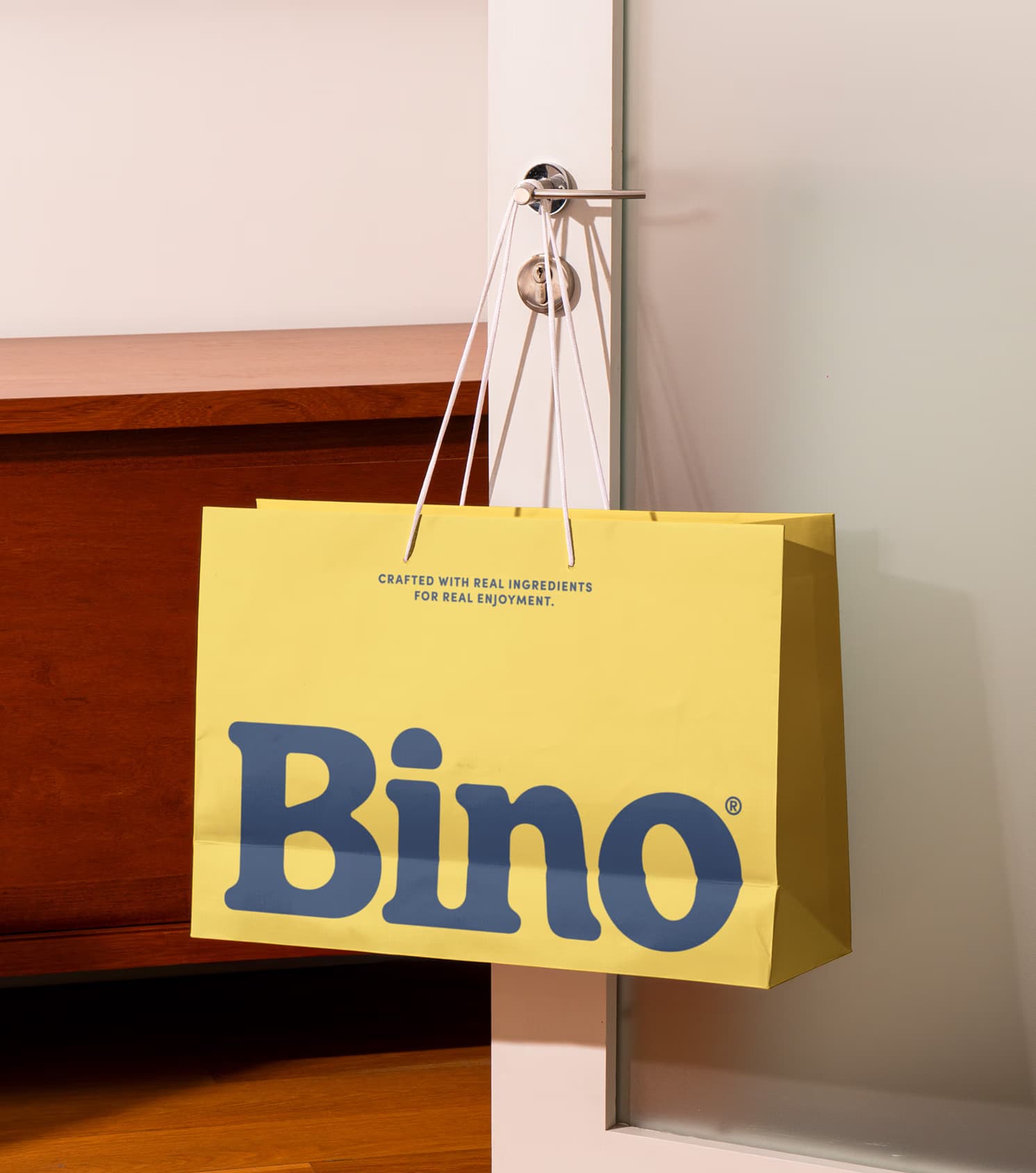
We refined and amplified the existing wordmark, giving it more confidence and a stronger role across the identity. Its bold, flowing letterforms bring warmth and personality to the brand, while the increased scale makes the BINO name immediately visible on pack.
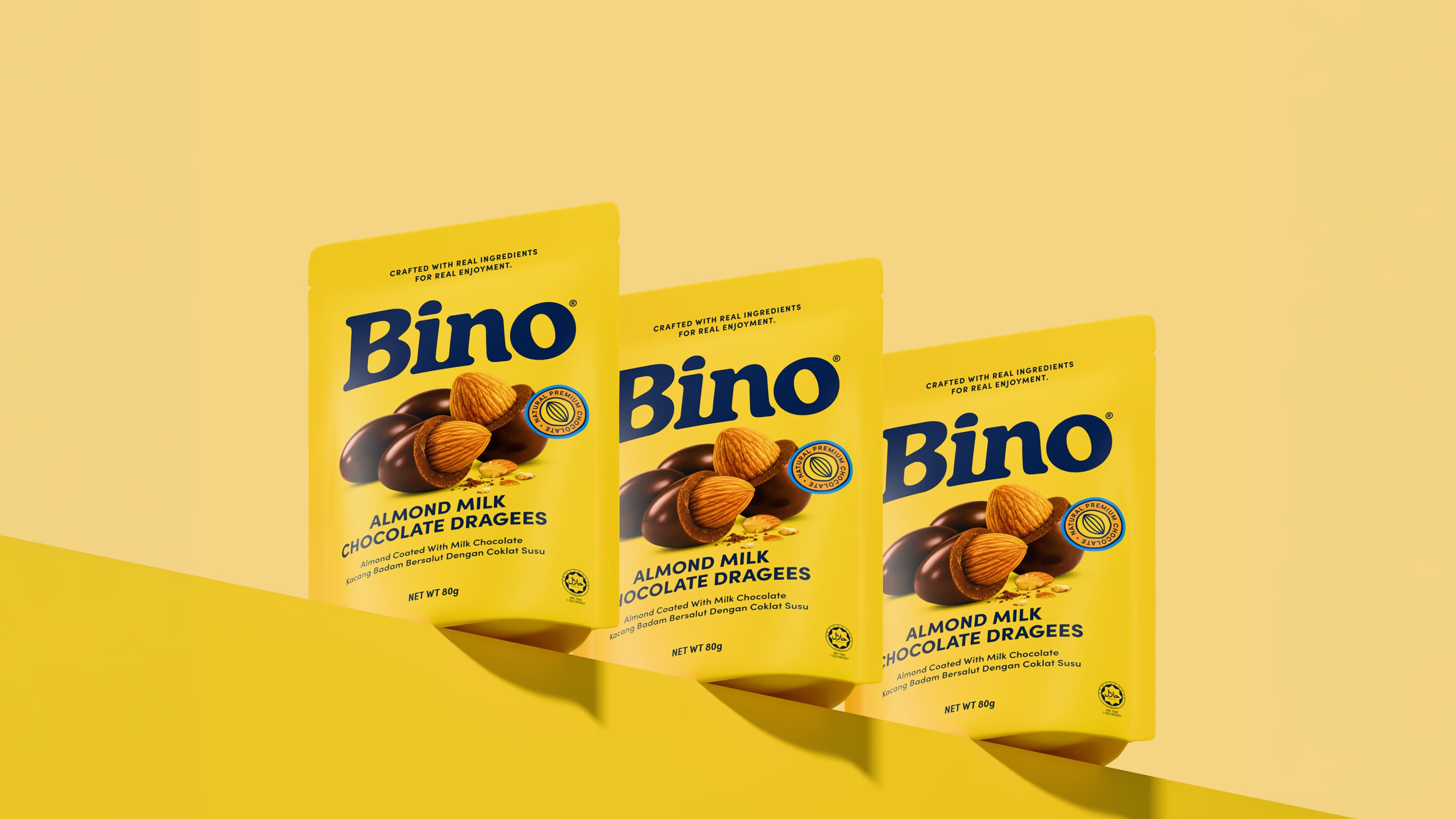
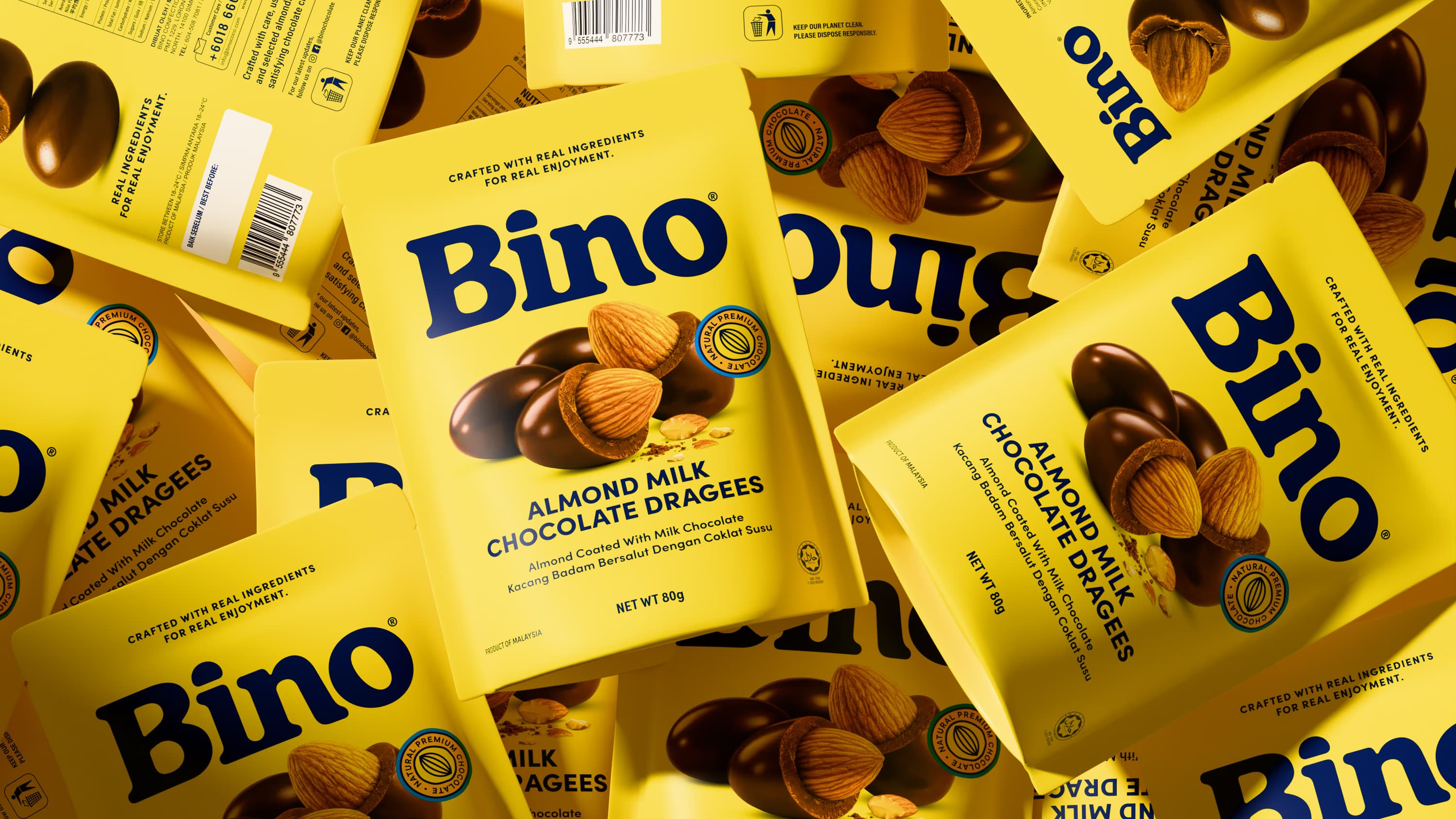
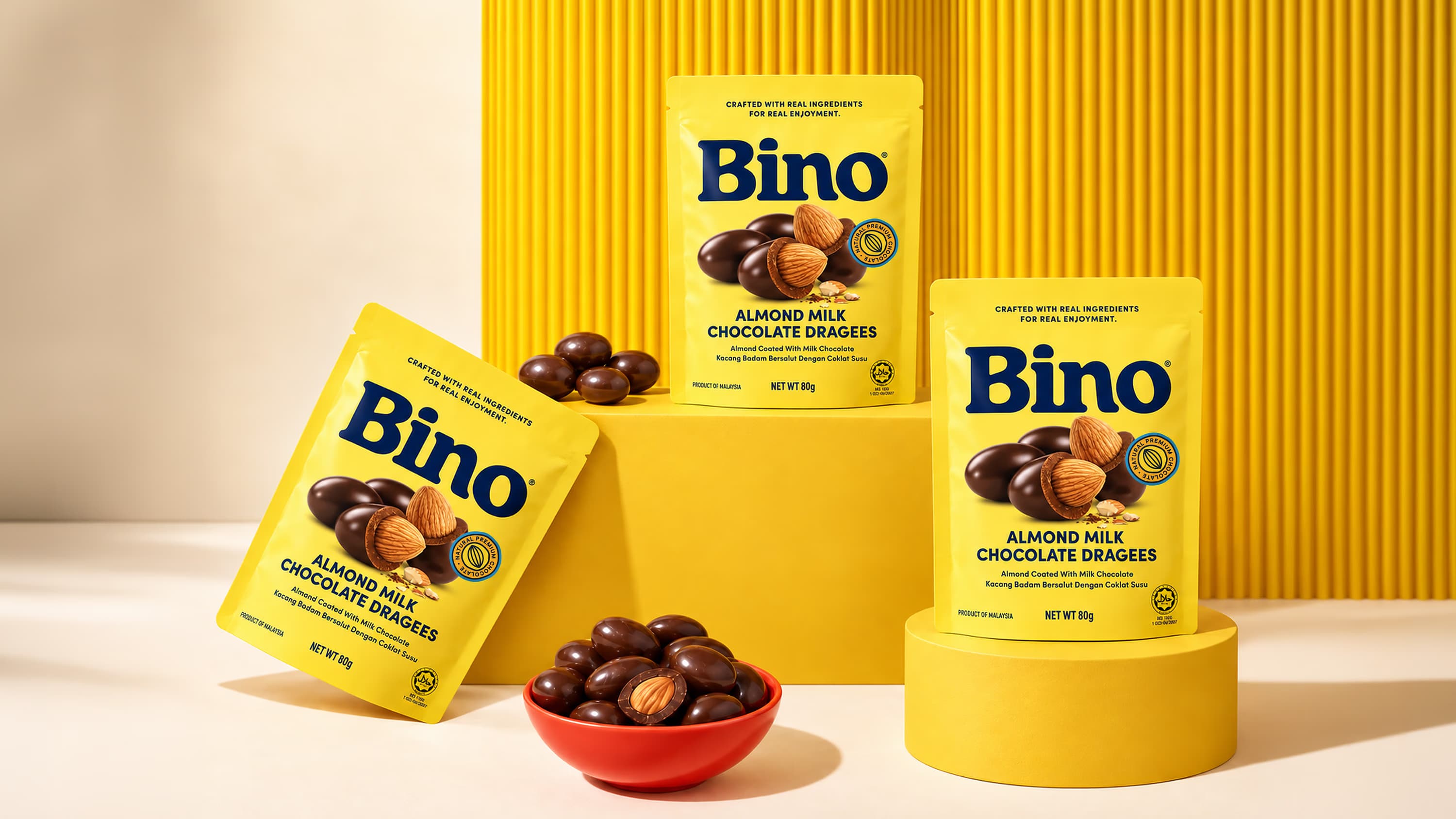
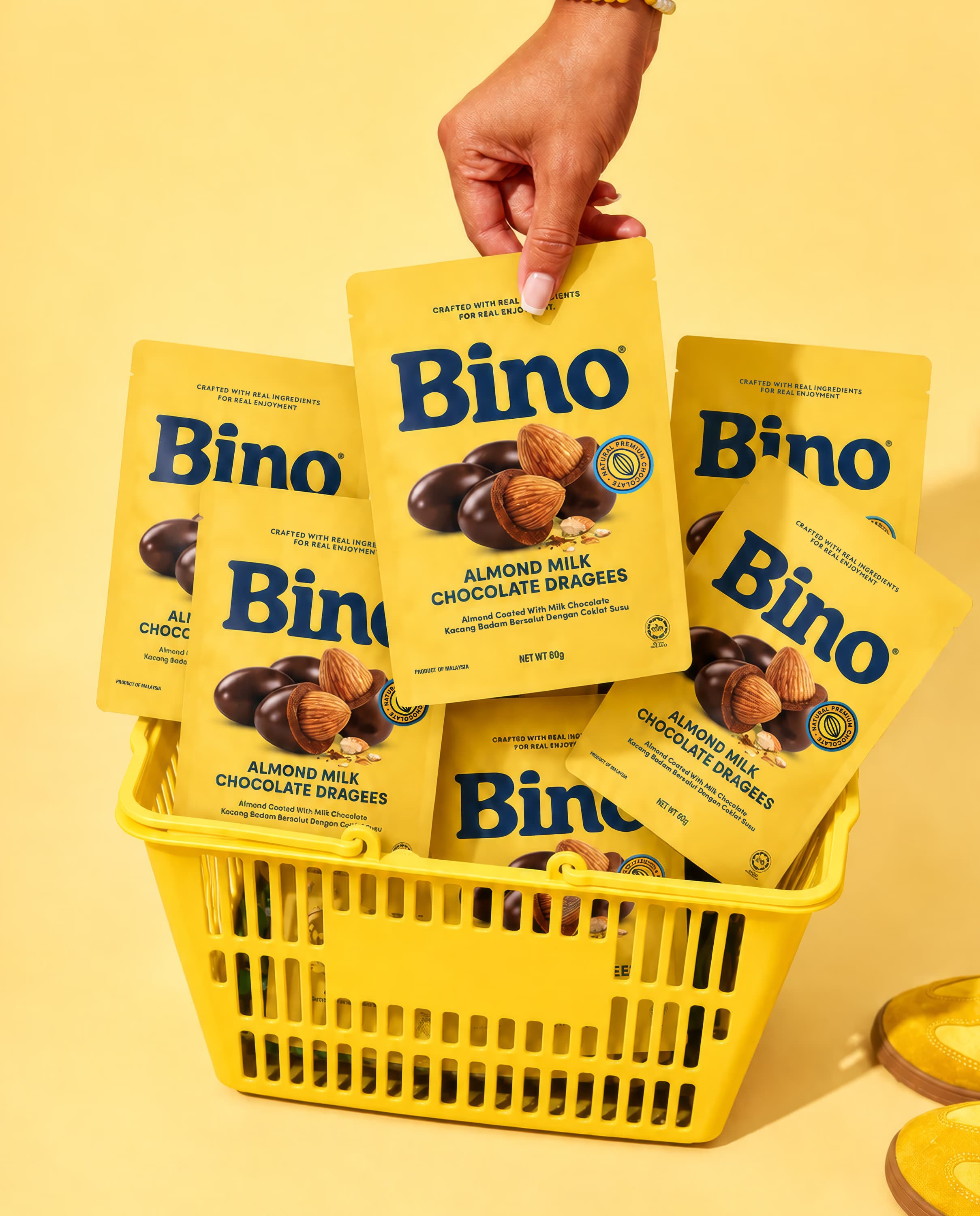
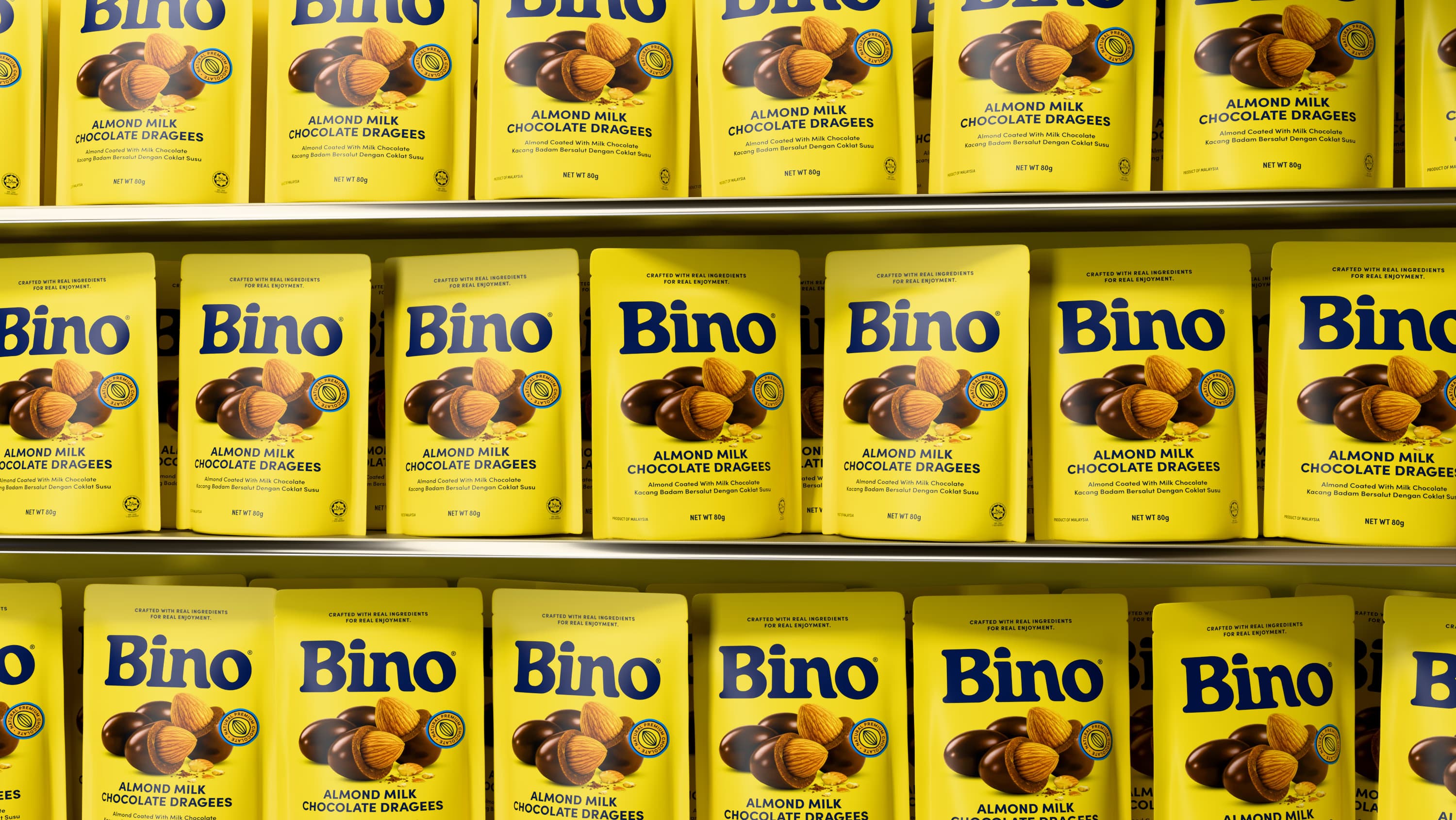
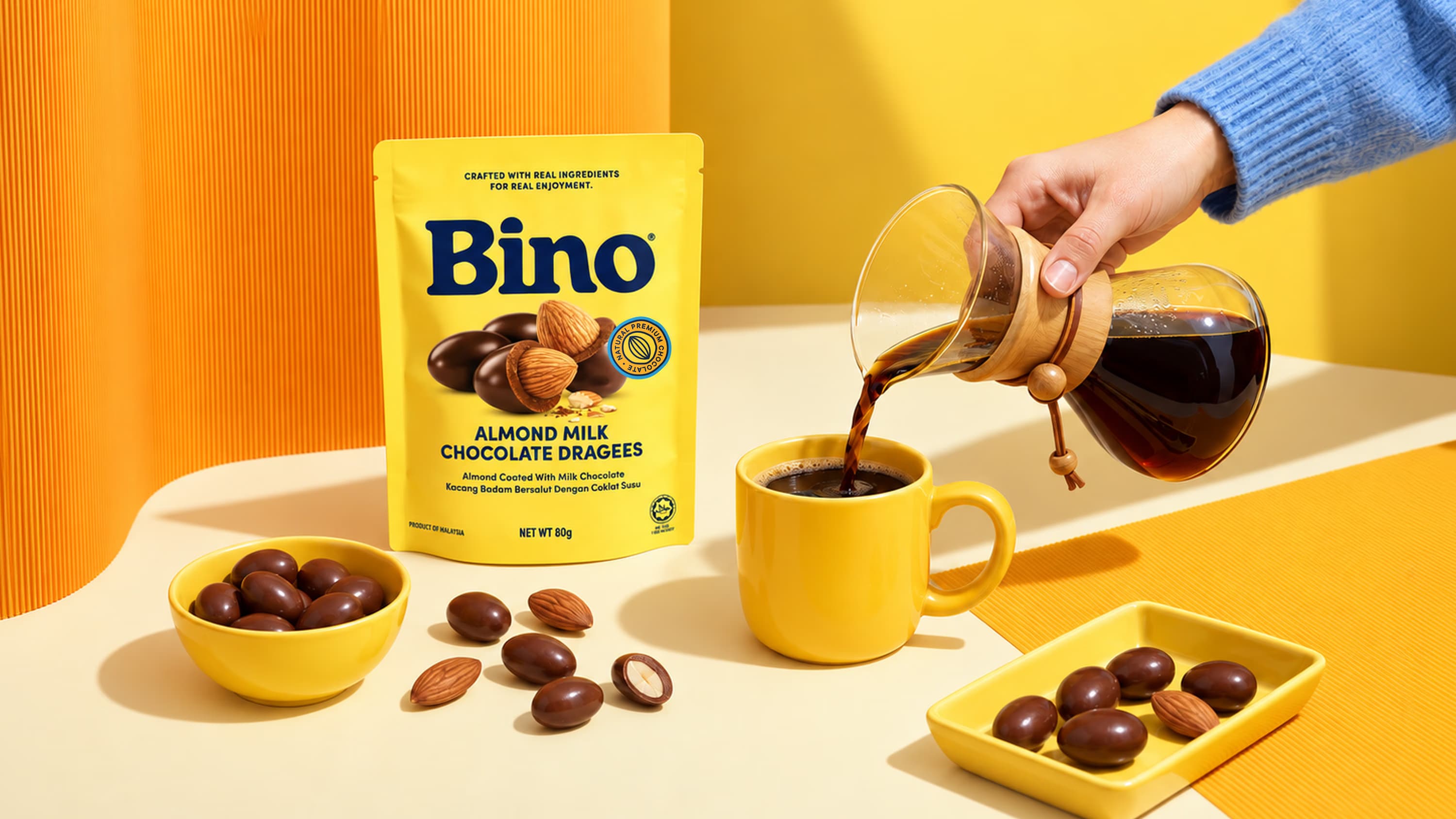
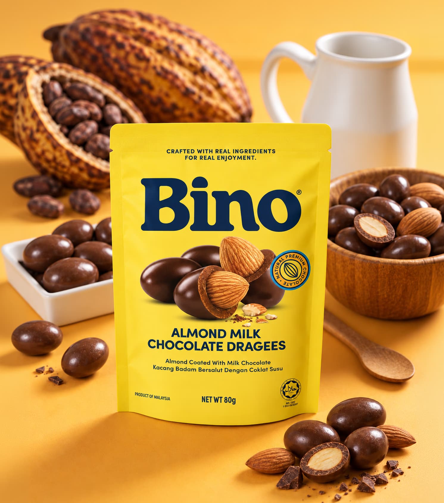
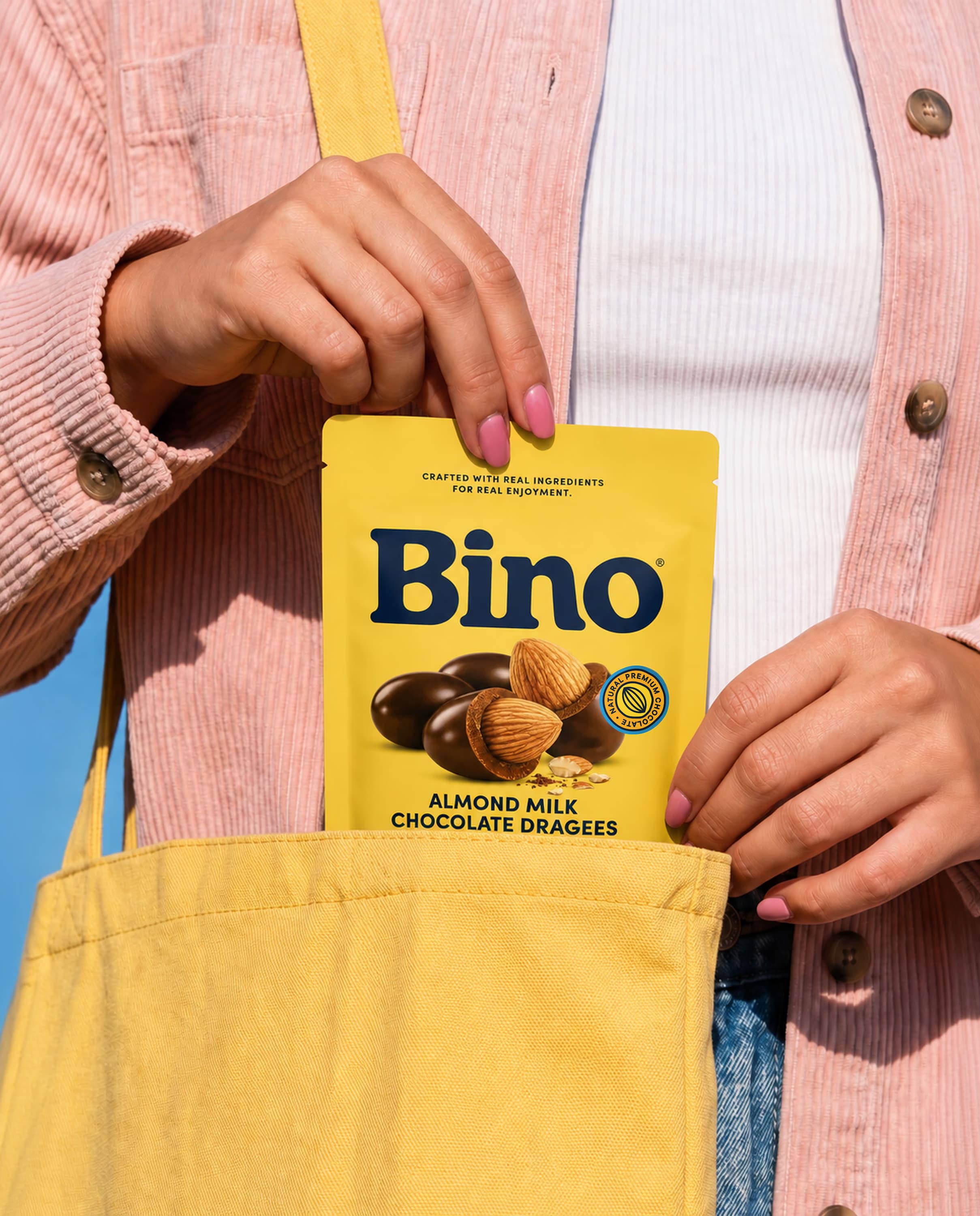
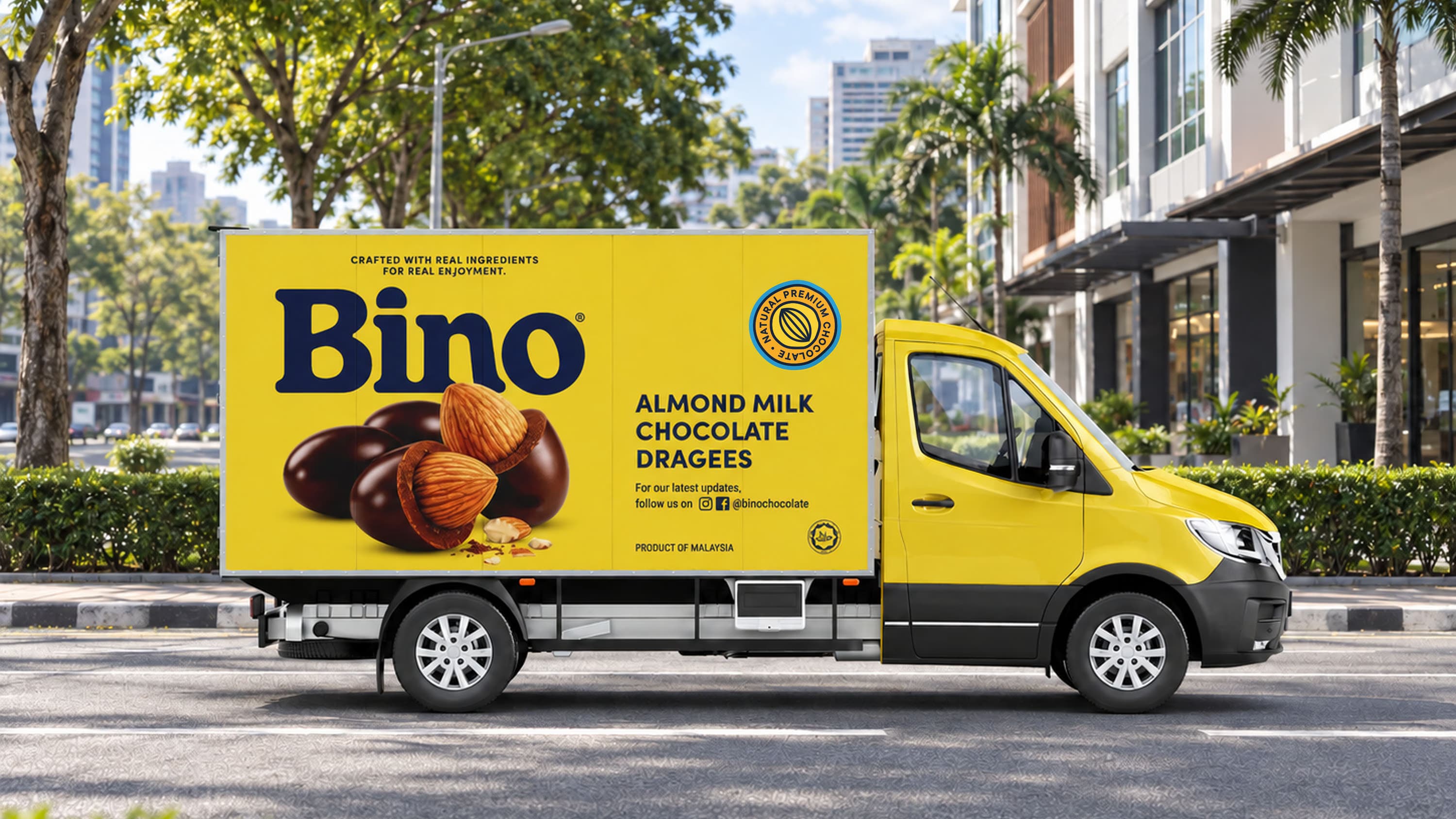
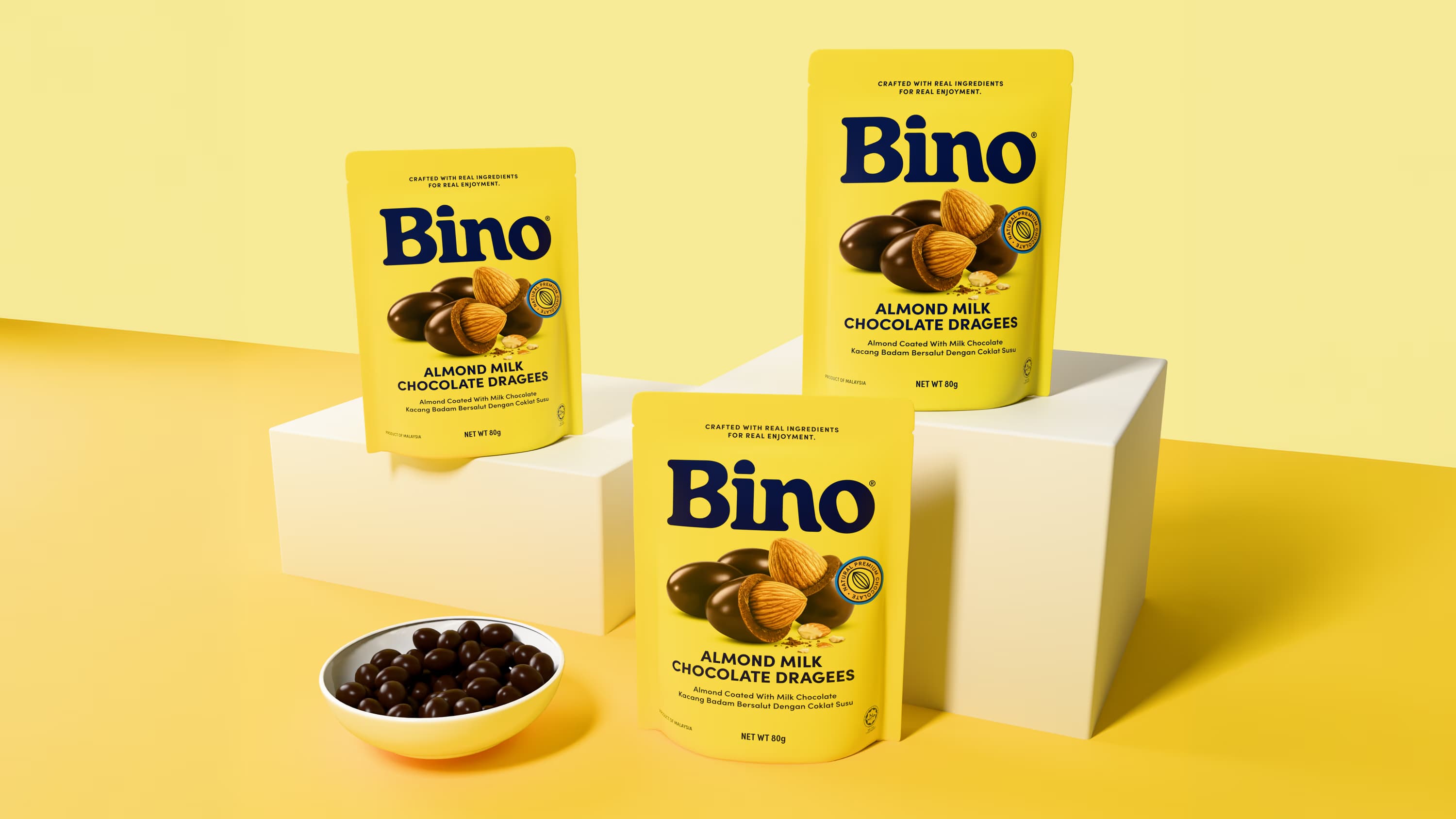
Yellow was established as a core brand asset. Used consistently across the portfolio, it creates a strong block of colour on shelf and gives BINO a recognisable presence. Deep blue adds contrast and refinement, bringing balance to the bright and joyful palette.
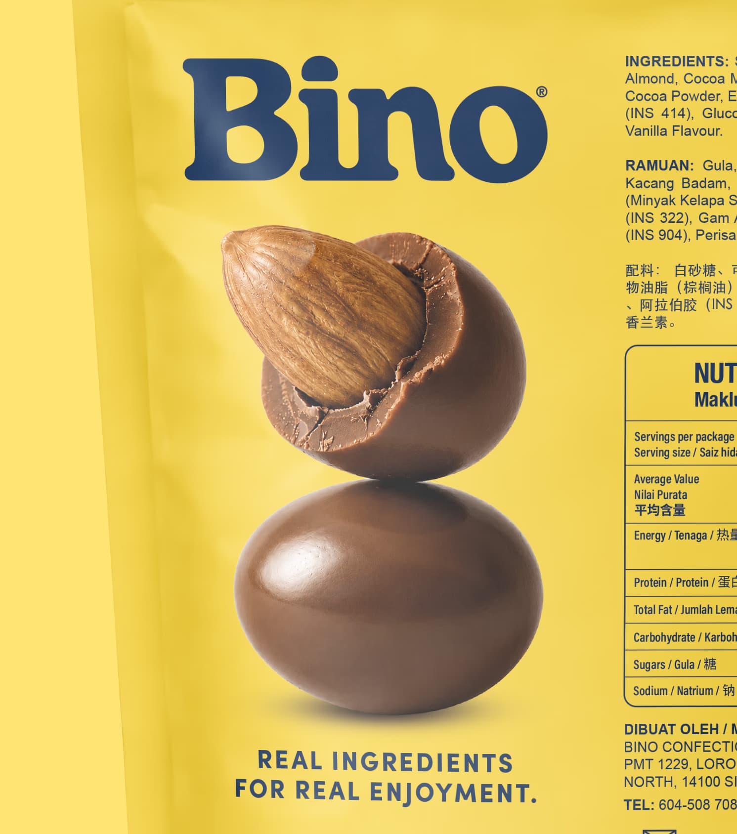
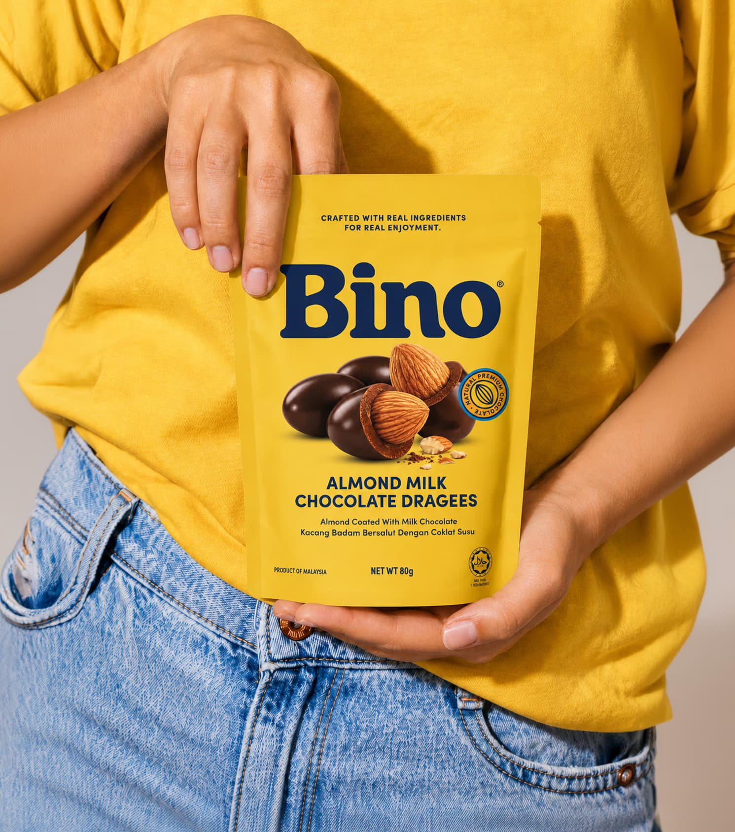
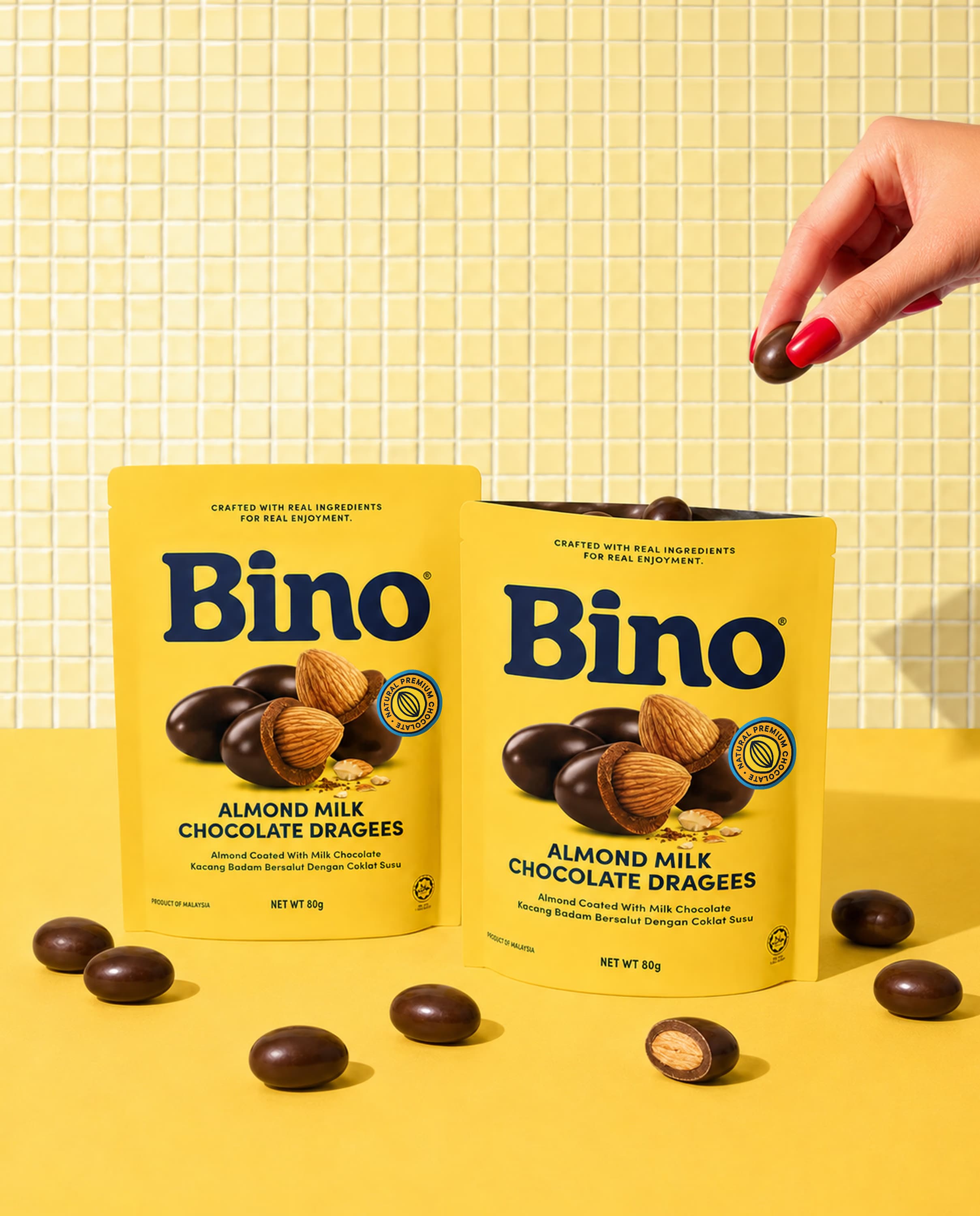
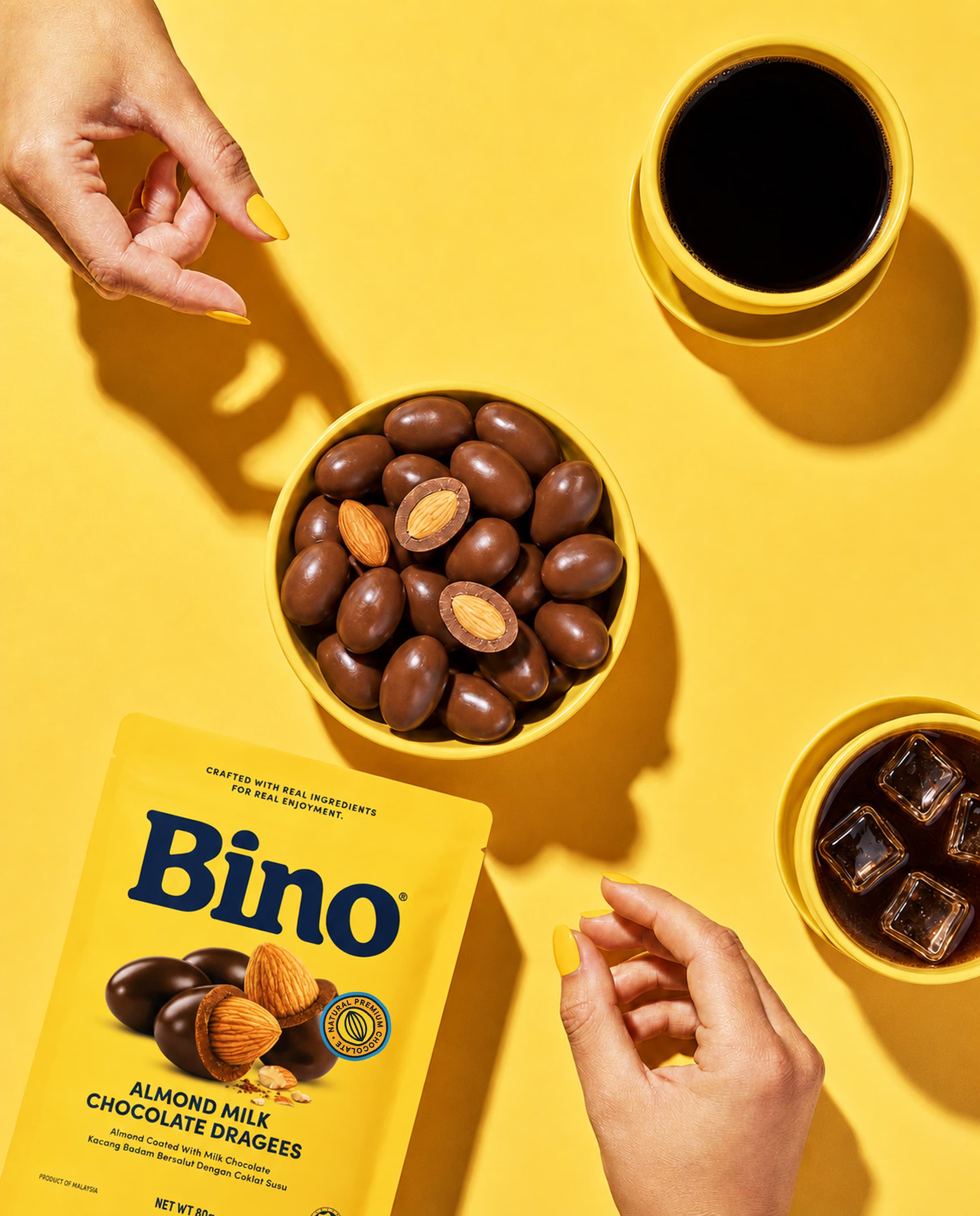
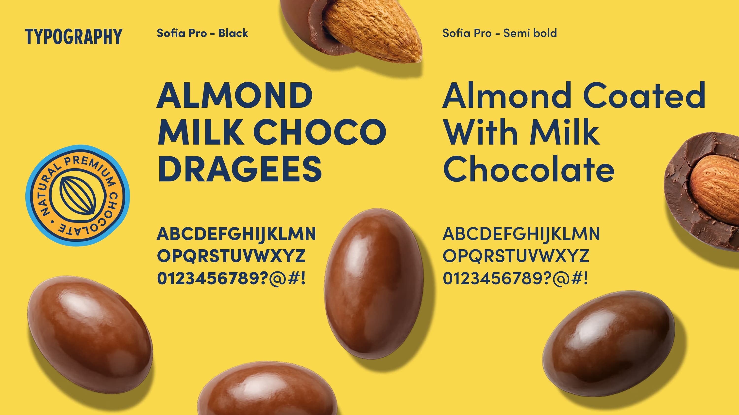
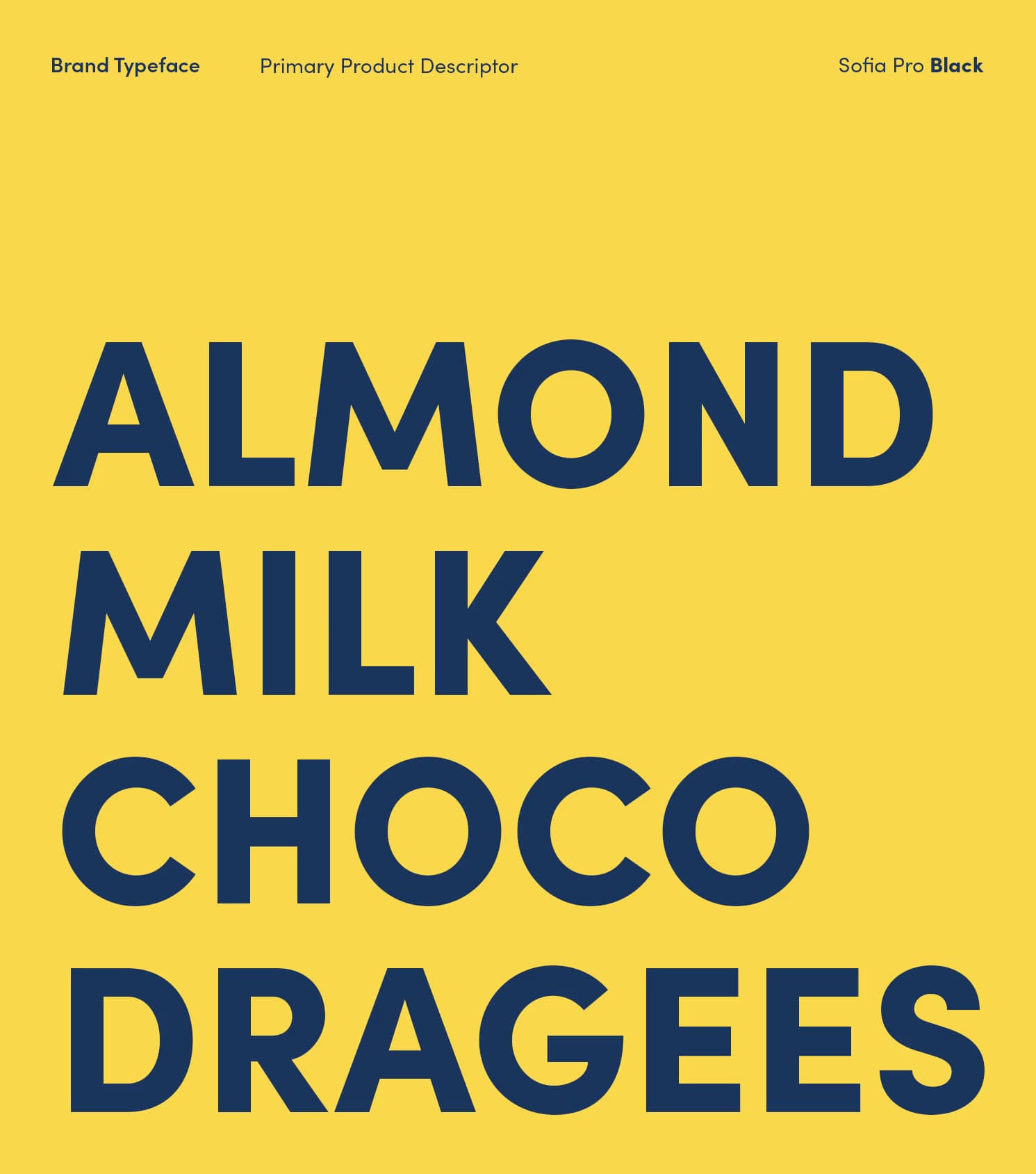
The packaging was simplified to create a clearer hierarchy. The BINO name leads, followed by the product, its ingredients, and its flavour. Rich, close-up imagery brings the texture and indulgence of the chocolate forward, while direct typography makes the range easier to recognise and navigate.
We developed “Crafted with real ingredients for real enjoyment” as BINO’s defining brand line. It connects the quality of the ingredients with the pleasure of the product, turning the brand strategy into a simple and memorable promise. The line also gives BINO a consistent voice across packaging, retail, campaigns, and future brand experiences.
OUTCOME
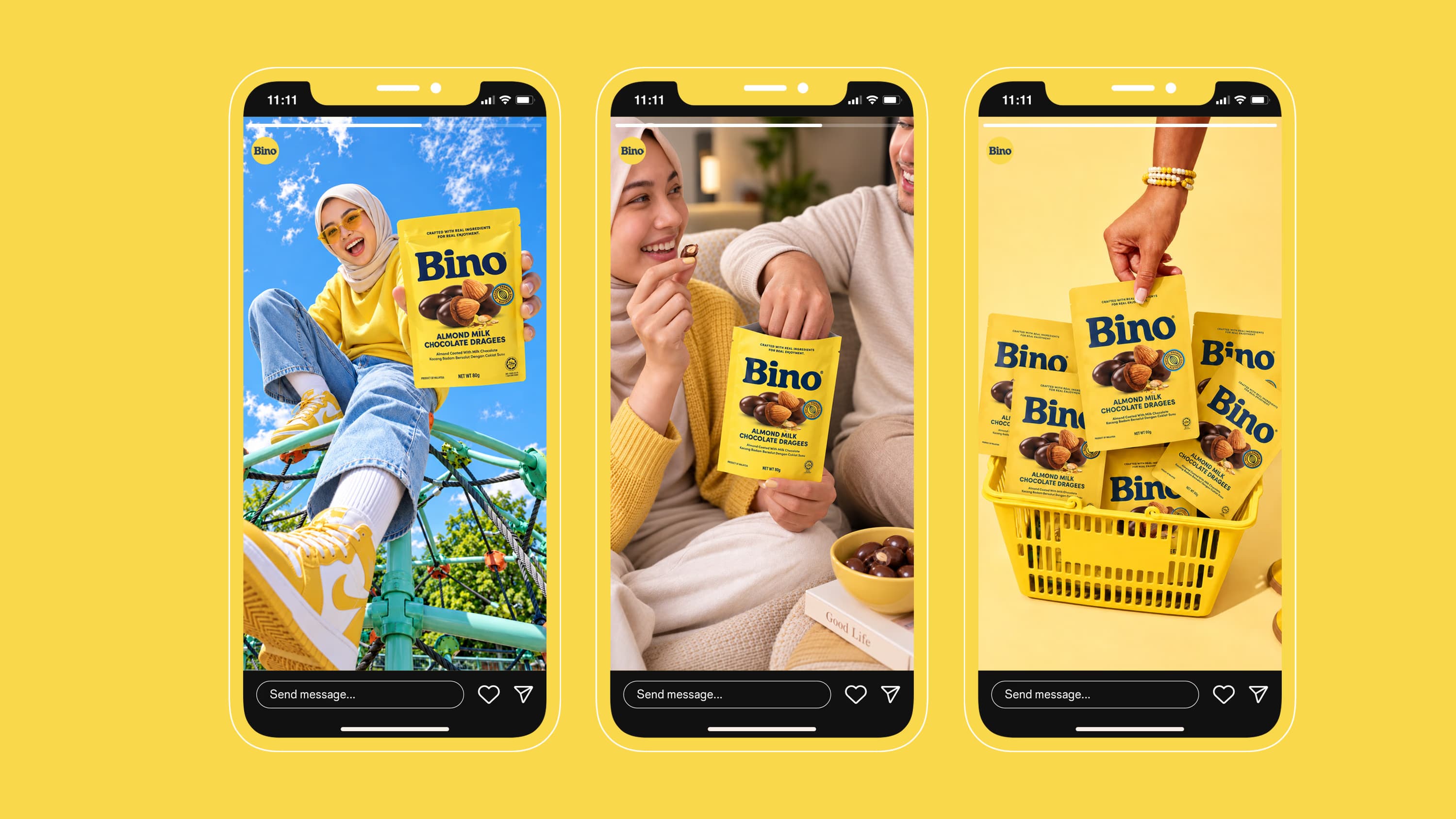
The new identity gives BINO a clearer and more consistent presence across every touchpoint.
The wordmark, colour palette, imagery, typography, and brand language now work together as one system. Together, they make the product easier to recognise on shelf while giving the brand enough flexibility to grow across formats, categories, and markets.
BINO now looks as generous and satisfying as the chocolate itself, with an identity designed to be recognised, remembered, and chosen.
Client
Bino Confectionery
Industry
Food & Drink
Services
Rebranding Logo Redesign Visual Identity Packaging Design Tagline Development